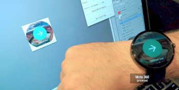
Moto 360 prototype looks flippin’ huge compared to the LG G Watch
In a piece titled “An Android Wear Design Story,” the folks at the official Android Developers blog are giving us a nice little behind the scenes look at developing for the upcoming LG G Watch and Motorola Moto 360. Well that’s all good and dandy, the focus online is quickly turning to a prototype of the Moto 360 that’s gaining attention.
While showing off the differences in layouts between the G Watch and Moto 360 — one with a square UI, and the other with a circular one — we’re treated to a nice comparison of each device, not only as it sits on the wrist, but in comparison to one another. The result is a surprising, “Holy damn, that Moto 360 is one big ass smartwatch!”
Now keep in mind these are only prototype devices. It’s possible Motorola has shrunken down the Moto 360 considerably in the time between this prototype and the upcoming retail version. We just don’t want you getting your hopes up. After seeing this hefty Moto 360 XL, has this screwed up anyone’s opinion of the smartwatch?