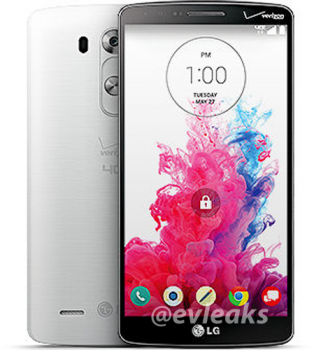
LG G3 leaks for Verizon, shows off front and back carrier branding, new lockscreen
We figured out why LG decided to go with a form factor closer to the previous G2’s, rather than the near bezel-less one found on the LG Isai FL: Verizon needed the space for their logo. Okay, we kid. But now that @evleaks is giving us a look at the Verizon Wireless version of the LG G3, we can’t help but wonder how any OEM allows Big Red to brand all over their face like that. Seems almost… disrespectful.
In any case, this latest leak is giving us a better look at the new lockscreen UI we can expect on the LG G3 once it finally becomes official. Looks a lot like LG’s previous UI, only more flat. We like that. If nothing else, this should help Verizon customers sleep well at night knowing the smartphone is headed to their network. As a new Verizon customer (for the time being), I for one couldn’t be happier.
[Evleaks]