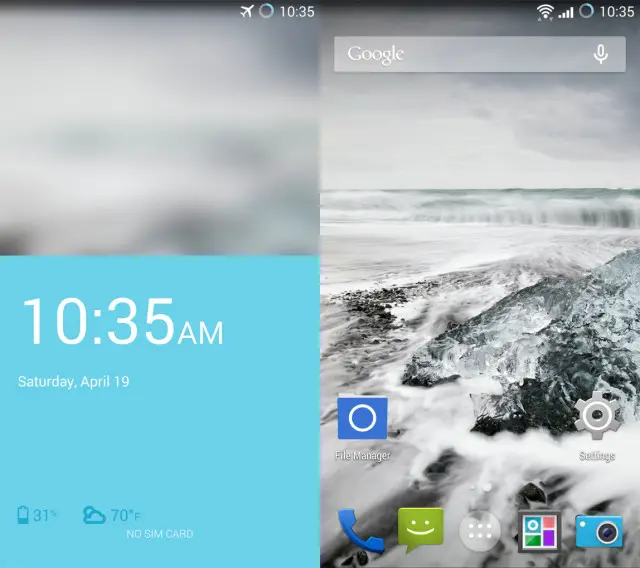
Earlier tonight we saw a supposed leak of the upcoming OnePlus One. The leak included press renders of the phone, a variety of back covers, and supposedly depicted the phones upcoming UI. Carl Pei of OnePlus took to the official OnePlus forums moments ago to put an end to the rumors running rampant this evening:
There has been a lot of speculation and excitement about the operating system of the OnePlus One. As you know, we’ve been working with the Cyanogen team on this product for quite some time, starting from when OnePlus was just an idea. Both teams have been deeply involved in both the software and the hardware parts of the experience, and it’s been an amazing ride so far.
Although we’re still running pre-production versions of CyanogenMod 11S, I’d still like to share with you some of the things that the Cyanogen team has been working on.
The new stuff is pretty cool, so here’s a taste of what’s to come.
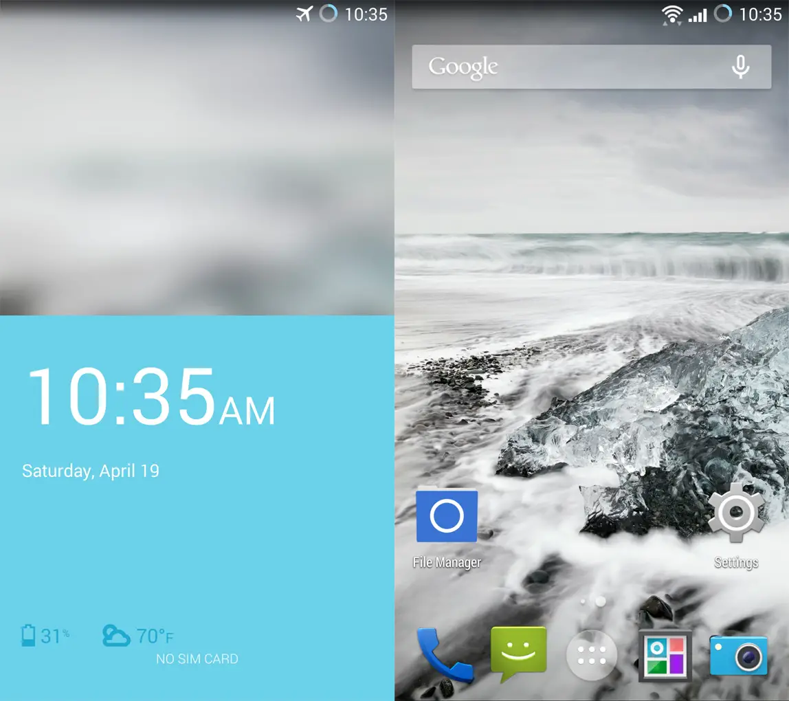
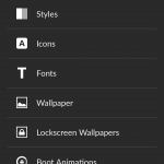
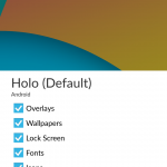
So there you have it – the default UI of CyanogenMod 11S. If you’re not a fan of CM’s new UI for Android, Steve Kondik has confirmed in the past that if you’d like to go back to the standard CM and Android Holo UI, you can. Just as shown above, visit CM’s Theme settings and select as much or as little Holo as you heart desires.
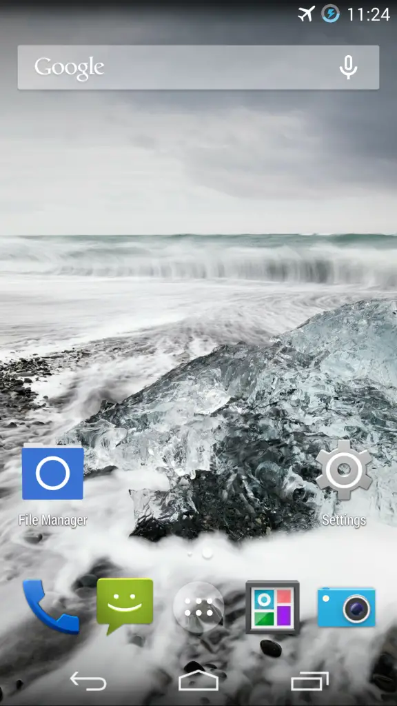
EDIT: I reached out to Carl asking for a screenshot with software keys. Here it is!
What do you think of the OnePlus One’s UI and CyanogenMod 11S? Let us know in the comments.
Source: OnePlus







Looks really good. Simple clean design. Love it.
I like it. They added small tweaks, but still looks stock.
Agreed. I was a bit worried, but CM did us right. There should have been zero doubt. After all, those guys are just super versions of us :P They want what we want. Clean, minimal, and perfect functionality.
Not really a deal killer but the home screen especially looks stock kk. UI’s can be imitated on most devices today, what I’m really curious about is the actual guts of this thing with battery life and how zippy its operation being the two things I’m more interested in.
Dat lockscreen. I’m gonna keep saying it. This phone just keeps getting better and better.
I’ve heard some cool things about that lockscreen, particularly the unlock animation :)
I was just about to ask about the unlock animation because other than that this lockscreen seems pretty par for the course. Something we can all easily recreate on our devices. Can you find a video of that animation or a gif?
Get back to work on that Find 7A review, please :)
Show me the phone, price and let’s do this
That looks very nice.
Installing this UI on my nexus 5
Phew, much better. What a roller coaster ride this has been
Very nice! Anything about the specs yet? Besides the camera.
https://scontent-a-hkg.xx.fbcdn.net/hphotos-ash3/t31.0-8/1780104_478349795604164_1793426765_o.jpg
This is great! Is that camera next alongside gallery next?
Yep new CM Camera!
Do you think that the theme engine in these is the one coming to cm11?
whew….dodged a bullet there….. lol
The press renders show the phone having capacitive menu buttons, then i don’t see the point of having on screen buttons too
You’ll have a choice on way or another.
Dat old school messaging icon… eeeyuck.
Dat Holo. But honeslty who cares. It’s all about Hangouts anyways.
It’s all about the Pentiums, baby.
Probably not Google Play approved yet so running whatever for the time being
I seem to be missing something! In the supposed press render leaks there seems to be capacitive buttons but there is a screenshot with on-screen buttons here…. which one is expected to be the correct one?
Apparently, you can switch it using a setting on the phone, the hardware buttons get disabled probably.
Ohh OK! Thanks for the answer. That never made sense to me but if the capacitive buttons are completely invisible when using on-screen buttons then it does make sense and its OK to me!
Beautiful !
Pure CM, I like it !
Is this UI available for the Nexus line?
The capacitive buttons are so old-fashion! They only take space on the phone! Software buttons are so much better! This is the only thing which will probably put me off buying the phone.
if there’s already a bezel, why take up screen space with software buttons?
plus you can turn off the backlight on capacitive buttons for much cleaner look than an additional row of ‘stuff’ at the bottom of the screen.
most of all, I like the choice to have either.
The SW buttons can hide in certain situation so they take no space on the screen. You can not hide the capacitive buttons at all so they always take space on the phone. Modern phone simply doesn’t need any HW buttons for navigation.
I’m sorry, but your incorrect. I’ve had capacitive buttons for three years now. with the light turned off, you can not see the buttons, the don’t clutter the look. but they’re always there when you need them.
if it was a choice between keeping the capacitive buttons and having no bottom bezel, I would always go for no bottom bezel. but there is a bottom bezel due to current engineering.
of course this is a preference, so there is no incorrect answer to which one is best.
This is the thing. Even if you turn the light off, you still have the badly looking bottom bezel which wouldn’t have to be there. The look without the fat bottom bezel is much nicer.
from what I’ve seen, modern bezel size has little to do with capacitive buttons and more to do with engendering. look at the note 3 with capacitive buttons, it has one of the smallest bottom bezels out there (and my ccurrent phone). then look a Z1 or M8…HUGE bottom bezels.
There should be no bottom bezel because it’s not necessary for modern phones.
The bottom bezel is going to be there whether you like it or not. Look at all the phones with software buttons. So the question is, are you going to take advantage of that space by putting capacitative buttons there (thereby giving you more space on your screen), or waste it and take up more space on your screen. Like Steven Taylor said, if the bottom bezel could be small enough, I’d take that in a heartbeat and go with software buttons. Unfortunately, it hasn’t been the case.
I can not agree that the bottom bezel must be there. It doesn’t. It would make the phone smaller and lighter.
the bottom bezel on an all metal phone is for the antenna. without that no signal.
Antenna has nothing to do with the bezel. Btw. antenna is usually in the top part of the back of the phone.
Keyword usually, on the metal M8 the bezel is where the antennae is housed.
You’re incorrect as well.
I’m siked for this phone. I am impatiently awaiting a chance to get my invite or earn One+ when they tell us how.
I’m psyched for this phone too! Bring on the awesome!