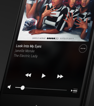
Sonos preparing overhauled apps for wireless speaker systems; grab the Android beta today
Sonos has announced that they’re fixing one of the only things “wrong” with their wireless speaker system — that their app will no longer suck. While the previous app “got the job done,” it felt quite dated and wasn’t an enjoyable experience for those who own a speaker system.
Thankfully they have introduced an overhauled user interface that should make things a lot more smooth, polished, easy and beautiful. A swipe-based user interface with flat design will bring the app out of the stone ages, and Sonos will make it easier to search and discover music from various music sources such as Beats Music, Pandora and Spotify.
Unfortunately the full app’s full release won’t happen until this Spring, but Android users are being rewarded for being on a platform with an open ecosystem. A beta program has been opened for those who want to try out the new features ahead of time. Simply sign into your Sonos account here and opt into the beta, and you’ll be able to get a sneak peak at everything before it eventually rolls out to the masses.
Don’t dismiss that beta tag, either — this means you’ll accept that things could be a bit wonky here and there, though you should be reporting those instances as often as you can. If you’ve taken heed to that warning and want to go through with it anyway, be sure to sign up at Sonos’ website right here.

