We already covered many of the main features in our Android Wear announcement post from earlier today, giving you guys a general overview of Android Wear, what it’s about, and how we might expect to use it in the real world. But, for those still wanting to dive a little deeper, Google has provided a few extra details about the new platform via their new Developer Preview page.
The main page shows developers how they can get up and running with the new Android Wear preview SDK, cautioning devs that apps built using the SDK are not for public consumption (production apps), and will likely break once the real SDK is released later this year. It’s also interesting that the emulator allows developers to build/test apps for devices with either a round (Motorola Moto 360) or square display (LG G Watch by Android Wear).
Android Wear: your smartphone’s best friend
Diving into Android Wear’s UI principals and design overview, we get a much better idea of how Android Wear will work on our wrists, as well as Google’s purpose for Android Wear. Just like Google Glass, Android Wear is simply meant to compliment the smartphone — not replace it. This means you shouldn’t expect to use your smartwatch for browsing YouTube videos, or purchasing a new bike on Amazon. Android Wear apps are merely an extension of their smartphone counterparts, and little more (at least not yet).
Google compares Android Wear to a good personal assistant, one that only bothers you when something is time sensitive or important. In fact, Google says it’s only time-based reminders or important messages that should ever cause a smartwatch to vibrate. For everything else (social network updates, steps taken, etc.) these notifications should be silently added to the main timeline.
The stream
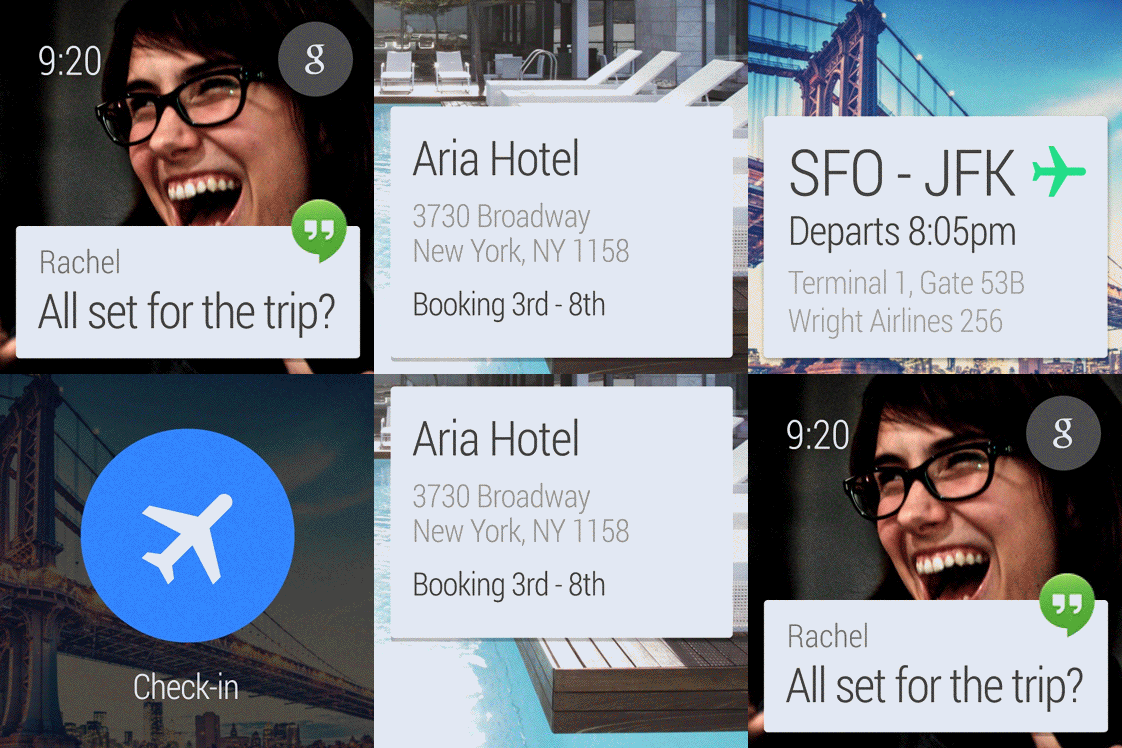
The stream is the main homescreen of Android Wear, and it’s where users will find all their notifications by scrolling vertically through their stream. Similar to Google Now, Android Wear’s stream behaves in much the same way. Many of these cards are contextual, showing notifications for flight times, the amount of time it’ll take to commute home, or other reminders.
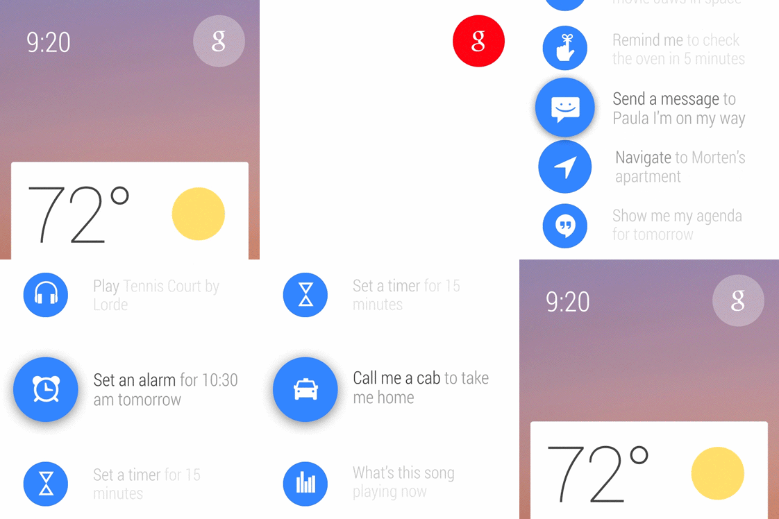
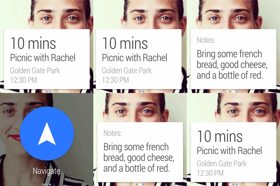
Swiping left from a card will reveal actions (or additional pages) available for that card or back will take you to the main stream. It’s quite a different approach that what Google took with Google Glass, but provides for a more visually appealing experience. Similar to Glass, users can scroll through a variety of voice actions, by clicking the Google Search button in the upper right hand corner of the stream. There they can take notes, call a cab, play music, or send a message.
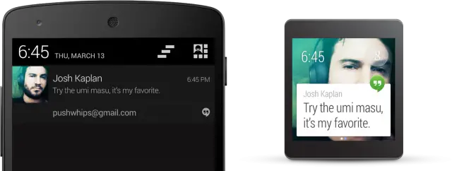
As far as the UI goes, everything is meant to be glanceable and succinct. This will ensure users are able to quickly identify/read a notification, address or ignore it, and get back to their life with little-to-no downtime. Android Wear’s UI is built around a Google Now-like card interface, with app icons in the upper left hand corner to help identify the corresponding app the notification was sent from.
Actions
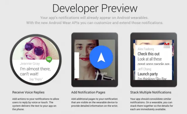
In most cases, Google says notifications wont require any action at all. When they do (like when receiving messages, for instance) swiping to the right of a notification will show available actions. Google specifically made it so only 3 actions will be allowed by developers, providing options like “reply” when receiving a message notification, “archive” for emails, or “navigate” for directions.
Pages and stacks
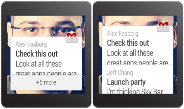
Because not all information will always fit nearly into a tiny card, some apps will have additional pages that can be swiped to. Unlike actions, there is no limit to the amount of pages that can go into a notification card (see above gif). When a single app sends multiple notifications, Google urges developers to consider grouping them into using a stack.
With stacks, Google unsure that users’ timelines aren’t littered with multiple notifications from a single app, keeping things neat and tidy. When in a stack, cards can still have their own individual actions, so developers can really play around with this depending on their app’s notifications.
Voice recognition and canned responses
There’s also no question that, until a Galaxy Note Gear is released, space on a smartwatch will always be limited. It’s this reason why Android Wear’s main form of input will be through voice recognition (just like Google Glass). For apps that require voice replies, developers can also add up to 5 canned responses like “On my way,” or simple “Yes” or “No” responses. This should make quick replies a little easier when you’re busy in a meeting, or while at work.
Android Wear officially has us excited about wearables again
If you made it this far, that’s pretty much the gist of how Android Wear will work when it debuts on smartwatches later this year. As self-proclaimed tech enthusiasts, the entire Phandroid team is extremely hyped over the release and absolutely can’t wait to see all the great new hardware that comes out of it. Sometimes all it takes is a little Android to come in and liven up the place and it seems with wearables, it’s no different. The future is bright.
[Android Wear Developer Preview]




“only bothers you when something is time sensitive or important”
Let me check my schedule for the next 10 years… nope, nothing.
This looks amazing! The UI looks super attractive, and there’s enough functionality to justify buying one.
It’s essentially Google Glass without the camera and the whole “looking stupid” part. :P
Before the end of the year we’ll definitely have Android Wear devices with cameras
I hope so! ;D
#creepshots
i still want the camera and heart rate monitor…. but i got excited when i saw “play music” in the background considering i dropped itunes for google
i prefer Google Music over iTunes.
Not to sound troll-y, but why would you ever want to take a picture with your watch, instead of your phone? Have you ever wished your watch had a camera in it before learning about this? Not to mention how incredibly silly it would look, or the poor quality of the camera…
When I dont have my phone ill have something, and bang for your buck of course
would be nice if you can control actions for apps so you don’t have to pull your phone out of your pocket. for example, control volume for music and phone calls while on headphones (would be helpful since android headphones are only one button), mute calls, put calls on hold, add incoming calls. This is just for music and phone apps, but think about the possibilities.
I know it wasn’t mentioned in the preview, but I’m sure this part is coming. If they can do it with Google Glass, they can do it with Android Wear.
Agreed! I’m hoping something like this comes. Just imagine casting a song/video to your television from your smartwatch. *-*
I just hope it works w/ each Android device after 4.1. It would be a shame not to use such a good looking product w/ my Note 3.