
A new Google patent has surfaced at the US Patent and Trademark Office, revealing an advanced touchscreen radial menu system which could one day come to Android. The radial or pie-like menu system is a circular system configured with various commands and functions. The radial menu is separated into segments that become activated when selected, revealing additional options, or launching a function.
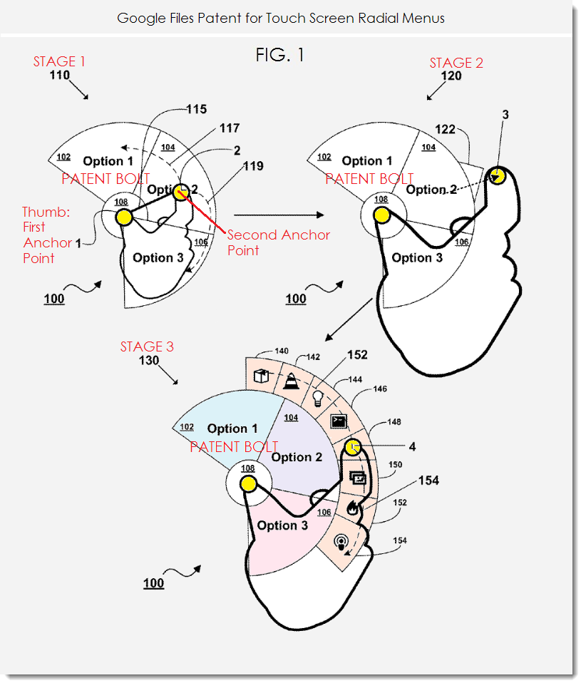
According to the patent, a user would use their finger to select an area on their touchscreen, acting as an anchor point for the menu. Then, while keeping the first finger point in place, a user can place a second finger on the touchscreen to determine the radius of the pie shaped menu. A user may then swipe their finger, spinning the pie-like menu, as seen in State 1 below. According to State 2, a user can move their finger from the position of Stage 1 to Stage 2 to determine if an additional sub-menu item appears. And lastly, as seen in Stage 3, if a sub-menu does appear, it can be selected to launch a particular application, function, and so forth.

This isn’t the first time we’ve seen a patent from Google surrounding a radial menu. Last summer a similar patent was published by Google, revealing another radial like menu. Last summer’s patent seemed to depict a radial menu being displayed after swiping up from the bottom or swiping from the side of a device. While they look similar, these two patents are very different in their functionality. The new patent does away with the bottom or side swiping method to activate the radial menu and greatly expands upon how the menu is interacted with once display.

This also isn’t the first time we’ve seen a radial menu in Android. The old stock or AOSP browser comes with pie-like controls as an experimental feature, the stock camera’s menu system was replaced with a similar looking and functioning menu system in Android 4.3, and custom ROM fans familiar with Paranoid Android are partial to the ROM’s PIE navigation system. Additionally, those familiar with the Samsung Galaxy Note 3 are probably familiar with Samsung’s take on radial menu’s with their “Air command” feature.

Google filed for this radial menu patent back in Q3 2012 and was just published on March 13, 2014. As we’ve come to know, patents don’t always equate to product launches, they’re just ideas. We may never see this type of menu system come to Android, Chrome OS, or any other Google product in the future. Google IO 2014 is just around the corner, so we’ll keep our eyes peeled just in case.
[Source: Patent Bolt]





Well cool I guess, I have been using this with LMT for a long time.
I’ve actually never used LMT, but I’ve used PIE in Paranoid Android, which is similar.
LMT is just a much more customizable PIE, I’d recommend it even if you are on a rom that has PIE built in.
Edit: Just had to add, you can actually enable and use LMT without making any lasting changes to your device, simply disable and delete the app to rid all traces if you dont like it.
I’ve been using PIE outside of Android on my plate for more than 15 years now as a dessert.
Oooo! Two days late on posting this one. ;-P
Was too busy drinking at happy hour with monkeys forgive us.
They already use this menu in the camera yet it is the one example you do not display.
I didn’t display the example, but I did mention it: “the stock camera’s menu system was replaced with a similar looking and functioning menu system in Android 4.3”.
If that was the best they could do ?I hope the whole plans are scrapped.
It looks a lot like the camera ui they use already. To be honest, I really don’t like the touch and slide circular ui. Its difficult to use quickly. Of course, it doesnt use 2 fingers, but it’s really similar.
I agree, the camera menu is a bit hard to use at times. Hopefully the new spinning action to select an item as depicted in the patent makes it easier to use.
I still don’t understand why they can’t just give us something like a pull up menu with toggle buttons. Then I could go through and click what I want and snap. Fast.
And, as is not only shown in the patent, but also in real world usage of the stock camera on the Nexus 4, Option 3 (or it’s similarly placed option(s)) will be always obscured by the rest of our hand(s). Or does Google expect us to have translucent/transparent hands in the future?
Also, why is this seriously being patented? I thought general stuff like UI/UX couldn’t (or at least shouldn’t) be patented?
Shouldn’t be patented, but it can. Just look at Apple’s lawsuit portfolio.
A few months ago Apple patented the slap bracelet. Not joking.
If Apple could patent being unreasonability they’d do it just to prove a point (as well as to make everyone else’s lives more tedious and annoying with lawsuits and static devices).
This belongs on the yet-to-be-released SMART YO-YO.
Otherwise,pass the barf bag please……
(Passes barf bag). Aim for an old iPhone if the bag gets full.
Most watches have a round shape.
True, but I doubt this would be used on a smartwatch. A leak puts the Google smartwatch at 1.65 inches. Two fingers would cover most of the display. You couldn’t use these controls as your fingers would cover everything. You couldn’t see what you were doing.
That would actually be pretty cool, now we won’t lose valuable screen space from those on screen buttons, but something like samsung’s air command would be simple, I don’t want to turn my head when it pops up like that screenshot above.
The screen real estate is why I use Nova and GMD Gesture Control together. No icons permanently taking up any space on the screen at all. They’re only there when I really need to quickly open an app and then they’re gone again.
I used it in the old default browser since 4.0, I actually miss it in Chrome. saved screen space.
Yes. And it was actually around since Honeycomb!
Like I said above, it was one of the few Honeycomb features that was great! Sorely missed in Chrome.
This could be pretty useful. If you’re able to dive deep into settings right from the main screen it can increase productivity greatly, no more swiping down endlessly.
Being able to patent “ideas” without actual process and execution is everything wrong with patents today.
Radial menus have been around, or at least been theorized, for a long time. They often come up in discussions about Fitts’s Law, which says they should be faster to access than normal dropdown menus, since every element is an equal distance from the starting point.
I haven’t read the details, but from the sreenshots this patent appears to be a method for *launching* the radial menu, i.e. via a two-finger swipe gesture — not a patent on the radial menu idea by itself.
Anyway, even though they’re superior in a number of ways, it’s possible to butcher the implementation, as Google did with their first incarnation of the new camera menu — where your finger would accidentally obscure a number of the elements.
Fitt’s Law states that anyone who dislikes exercise will be unfit.
PIE is the TITS!
After using the stock Android camera controls, this patent looks about as valuable as a pistol that fires backwards.
That pistol would be a nice gag weapon though.
Only a good gang weapon if it fired backwards while you hold it sideways.
I hope they don’t use this system in their software. I have limited use of my fingers so using two fingers at the same time would make things much more complicated. Pinch to zoom is already hard enough for me to do and this menu system would require much more finger dexterity. That’s why I love when apps use double-tap with finger slide to zoom in and out, like with maps. Swiping in from the edge would be much more usable for people like myself.
Pie controls are cumbersome and not as useful now that almost all phones have huge screens
On the contrary, that’s exactly why they’re useful. They make one handed navigation more reasonable on large screens without restricting us to the skinny apple screen.
I would like to point out that I agree with the “pie controls are cumbersome” section of this comment regardless of how I feel about the “huge screen” section…
Exactly. My take on PIE controls is that I like them in certain situations, but that’s the beauty of customization.
I can use the normal navigation buttons most of the time, but PIE controls stay out of the way until I need them (one-handed usage). Best of both worlds.
This looks more like a defensive patent to me, to just stop others from using it.
This is copying Air Command on the Samsung Galaxy Note 3…
yeah I was going to say there’s at least one example of Prior Art on this patent in the Air Command menu. Perhaps it won’t count though since it’s limited to the stylus on the Note3.
Similar controls had already been in place on the stock android browser, so while there is prior art, at least some of it is from Google.
I liked the radial controls in the stock browser, was sad to let them go when switching to Chrome.
This. And you beat me to the punch (I said the same thing above).
Ironically, a great feature that started in Honeycomb. Honeycomb’s AOSP browser was the first to have this.
Seems like a pretty good idea, i’m not a fan of patents though.
Neither am I, but then other companies like Apple or RockStar will patent it and use them to keep future Android flagship devices off the market.
This is what they have to do until patent laws get reformed.
two fingers is no good. It negates one handed operation. I have been saying for a long time that something in the style of the wave launcher application or pie controls from some custom ROMs would be great.
It would be nice if Google bakes in controls like the LMT Launcher into the OS. I find it to be more useful then the PIE Control of PA.
Welcome to the next “have-to-have” feature of Android 4.5/5.0. Can’t wait to hear someone tell me how I could’ve gone this long without ever having this feature and why I need to have it on my next Nexus phone.
Or, you know, like the Quick Controls that the Honeycomb web browser first had as a Google Labs setting. I wish Google would bring those to Chrome someday.
But, just saying, Google isn’t a stranger to PIE-like controls (at least in the AOSP browser). My two cents.
Yep, which is why this exact thing was referenced in the article.
Psh! Who actually reads these articles anyway? We don’t actually need to understand the content of an article to take part in a discussion about it! This is the 21st Century; we don’t have the time for accuracy or comprehension! You lost me at the first hyperlink that I opened in a new window and closed before it loaded anyway.
Ain’t nobody got time fo’ dat!
Could be used with Google Glass too…maybe?
Apple will predictably claim that a circular menu is merely a special case of a rectangle with rounded corners.
Doing that would take a special kind of douchebaggery I don’t think I’ve seen too often. It’s possible, though.
Article’s author doesn’t know the difference between a patent and a patent application. What was published on March 13th was simply the application. As far as I know, NO patent has issued for this application.
Google is building something circular.. My guess is for their smart watches. This is the reason google purchase the thermostat company Nest.. By the way, those Nest thermostats have a great and simple UI design if you guys ever try them