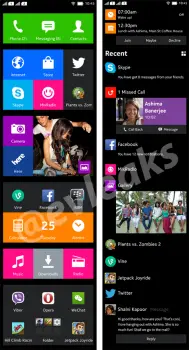
Nokia Normandy user interface leaks again; doesn’t know if it wants to be Windows or Android
We’ve seen just about all we could of Nokia Normandy at this point, but the leaks aren’t over. Another purported shot of the Android device’s user interface has leaked, giving us a closer look at what users might be treated to if this phone ever sees the light of day. What we’re treated to is an experience that seems markedly confused.
This is supposed to be Android, but you can clearly see Nokia doing their best to emulate the Metro look-and-feel that the Windows platform is now known for. The original leakster, @evleaks, put this caption alongside the leaked image:
Two ways to interact with Normandy.
That would suggest that the right portion of this user interface is another option the user can switch to in case they’re not down with the tiles. Either way, what you see is atypical of normal Android devices, seemingly giving the user no way to freely place widgets and icons. It’s tough to say how well this would pass with consumers without having used the device or seen a full demo of the user interface.
We imagine those who have grown accustomed to the classic Android experience won’t be particularly inviting of what the Nokia Normandy would bring to the table. We’re still wondering if Microsoft is going to let this fly (assuming their proposed purchase of Nokia is approved by all the relevant governing bodies), so we’ll try not to get too ahead of ourselves and pass judgment either way.
[via WinSource]

