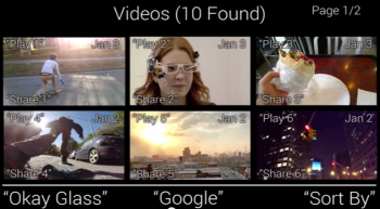
Google Glass’s interface feel a little sloppy to you? This video shows some possible improvements
While it would appear that everyone under the sun with a pair of Google Glass is enjoying it immensely, there are still some complaints that many feel need to be addressed before the product is ready for public consumption.
One of those problems is the user interface — it’s just clunky. Part of the problem is that the screen real estate doesn’t leave much room for sensible user interface design. Google employs a scrolling mechanism to give you access to all your things with the swipe of a finger, but having all of those things jumped up into one unorganized list is counterproductive (and makes for some very tired arms).
Serge Berig identified some of these shortcomings, and took it upon himself to present a proof of concept of a new user interface design that could help settle some of these issues. For instance, a folder/hierarchy system would make it easy to sort between photos, video and other multimedia. If all you want to see are emails, then you’d be able to dip right into email and nothing else. As it stands, there really is no easy way to drill down into a specific subset of items like you’d do with a smartphone app.
Some of his ideas might not be possible due to the limited space inside the projected heads-up display, but the debate isn’t whether this specific implementation will work.
The real purpose of the video was to show Google how they could think differently about the user interface powering Google Glass, because there won’t be a ton of consumers willing to buy a product that’s hard or confusing to use. Let’s hope top brass from the Mountain View company sees this (though we wouldn’t be surprised if they’re already working on new interfaces behind the scenes). Watch the video above.
[Thanks Jake!]