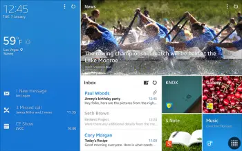
Is Samsung’s new tablet UI a rip-off of Windows Metro UI? [POLL]
You might have noticed that Samsung is using a new user interface for their Magazine UX on the latest Galaxy tablet devices (hands-on of which we have right here). We didn’t want to say anything before, but it looks like the word got out — it looks quite familiar. We’re talking about a light hint of Microsoft’s Metro UI used in Windows 8+ devices.
While it’s clearly not exactly the same, you have to wonder if Samsung borrowed some design elements from Microsoft to craft this new user interface. Our friend Joe from WinSource suspects Samsung did it to create a product that lends itself more to the business users that the latest Galaxy TabPro and Galaxy NotePro tablets are catered toward.
While no one can say for sure, we’re sure everyone has their own opinion. Personally, I think Samsung did borrow a bit from Microsoft, though they obviously used the power and flexibility of Android to create an experience that’s more useful than that of default Metro. Most of all, though, I think I’m just glad that they aren’t interested in trying to emulate Apple (though some supposed upcoming changes to TouchWiz seem to suggest they’ve dipped back into that trend for the phone side of things).
How about you? Drop a vote in the poll below, and let us know your thoughts in the comments section right afterward.
[polldaddy poll=7698230]