Hands On: Samsung Galaxy NotePRO 12.2, Galaxy TabPro 12.2 and all its little brothers [VIDEO]
Samsung had a bunch of great announcements at CES this year ranging from new washers, dryers, and cooktops to ultra clear big screen TVs with bendable displays. Of the new products showcased, several have Android, including four brand new “Pro” tablets dubbed the Samsung Galaxy TabPro and Samsung Galaxy NotePro.
All these new devices and so much to remember, let’s try and simplify things a bit. Of primary importance is the reason Samsung calls these devices “Pro”: they’re top of the line, cream of the crop devices with the premium specs targeting power users. All four of the new “Pro” devices have the following specs in common:
- WQXGA (2560 X 1600) Super clear LCD
- 8MP camera, 2MP front camera
- Android 4.4 KitKat
- IR Blaster
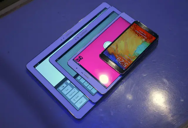
The four different devices are:
- Galaxy TabPRO 8.4
- Galaxy TabPRO 10.1
- Galaxy TabPRO 12.2
- Galaxy NotePRO 12.2
Sitting on top (for comparison purposes) is the 5.7-inch Galaxy Note 3.
The obvious difference is in the size, with specs also nudging upwards with each increase. The TabPRO 12.2 and NotePRO 12.2 are essentially the exact same device, except the NotePRO 12.2 includes the Samsung S-Pen Stylus, and will likely cost more for exactly that reason. Pricing and availability is still TBD.
The first reaction is to look at the 12.2 inch behemoth’s and be blown away, and for good reason. But first, note how small and compact the Galaxy TabPRO 8.4 is and consider its WQXGA (2560 X 1600) Super clear LCD display. As far as we know, that’s the most pixel dense display for a tablet in its class on the planet. It’s beautiful. It’s impressive. Its worth staring at for a few minutes.
Make no mistake, though, the 12.2 inch TabPRO and NotePRO are where the real “new’ stuff is found: we haven’t seen a mainstream tablet of this size, ever. And despite what other manufacturers may argue, “mainstream tablet” currently means iPads, Galaxy Tabs, Kindles, and Nexii.
It’s unashamedly humongous which, like any device, comes with ups and downs. On the bright side, the device is so humongous that typing on a full screen keyboard is like being in your office and 4-window multi-tasking is a thing of beauty. On the down side, laying in bed and watching a movie could cause a hernia. I kid, of course, and when put into perspective consider that the 12.2 inch pro devices are almost as light as the original Motorola XOOM which it has essentially lapped twice in the spec race (1.65 pounds).
As seen in the video above, some of the TabPRO and NotePRO features that are especially enjoyable are the 4-window multi-tasking, large keyboard layout, the Hold CTRL + A/X/C/V for select all, cut, copy, and paste (which surprisingly I haven’t seen on a tablet before). Then you’ve got the “Magazine Layout”.
Pick up your tablet for the first time and you’re immediately welcomed by a very “happening” layout filled with widgets of all types and sizes. One page is for personal “stuff”, one for entertainment, and one for productivity. The widgets can be moved and resized to fit your needs. Unfortunately, many users may feel their “needs” are to completely remove the magazine layout and stick with the traditional Android homescreen, which isn’t an option.
I’m a bit surprised Samsung included this Magazine View on their Pro devices for a couple reasons:
- As seen on many Galaxy S4 and Note 3 Reviews, the optional Flipboard magazine experience accessed by pressing the home screen from the home screen was disliked by many. Making it the default is a bit gutsy.
- I associate the word “Pro” with power user and productivity and magazine layouts seem more consumer oriented and entertainment focused
But I’m not one to judge. I had these devices in my hands for less than an hour and, especially for the 12.2-inch form factor, real world use for a week or two is paramount to pinpointing it’s pros and cons. Hopefully we’ll be able to do exactly that for you in a full review when the Galaxy TabPRO and Galaxy NotePRO become available.
Watch Samsung announce the devices at their CES 2014 press event in the video below:
Take a look at all the Galaxy TabPRO and Galaxy NotePRO spec comparisons here!

