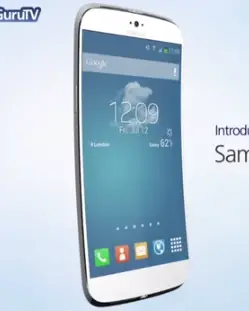
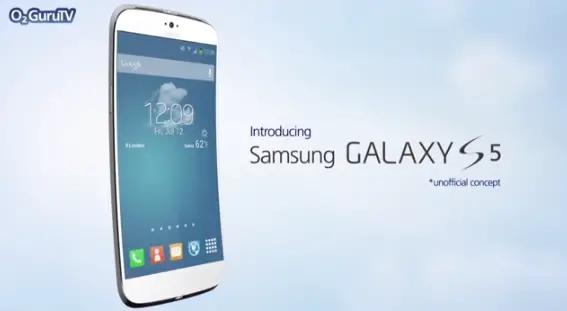
Tons of people try their hand at concept renders for future versions of popular devices, but they don’t always turn out well (nor are they always realistic). But this Samsung Galaxy S5 caught our attention because it’s something we can see Samsung doing whenever they introduce their next flagship smartphone.
The phone in the video features a curved design, except they imagine Samsung might finally ditch the plastic (and fake leather) from their current phones and adopt the metal finish we’ve all been waiting for. Samsung already did that with the Galaxy S4 Active, the rugged version of the Galaxy S4 that launched earlier this year.
Specs of the beast in the video above include a 5-inch “2K” Super AMOLED HD display at 2560 x 1440 resolution, which would give us a ridiculous pixel density of 587 pixels per inch. They also imagine the phone will have a 64-bit Octo-Core chipset with 3GB of RAM, which is not entirely off the wall considering some top phones already sport those sorts of specs today. A massive 4,000mAh battery is envisioned, though we have a hard time believing Samsung could fit that inside the slim metal 5-inch chassis.
For the camera, a 16 megapixel sensor capable of shooting 4K HD video is on this wishlist. Other features include Android 4.4 KitKat with a new version of TouchWiz, Samsung’s “S-Beats” stereo speakers, and more. It obviously wouldn’t be wise to put your faith into any of this happening, but it’ll be interesting to see just how close Samsung gets to this concept whenever they announce their next flagship at some point in 2014.






It won’t be metal. It’ll be a premium plastic though, perhaps faux leather like the Note.
If they commit to a flex, and removable battery, (which I believe they do) they stay plastic.
I’ve read that they’ll introduce it in January, and release it for sale in February.
I would be shocked if half of this made it into the next update.
I will not buy a curved phone. Period.
Idk man.. The LG flex is looking pretty good, with its ability to actually flex
People are resistant to change, I want a curved phone to reduce glare outside.
how’s a curved phone going to fit in my pocket?
Nice if it had the LG Flex flexing too.. But it won’t be aluminium then
aluminium is flexible… just depends how thick they make it
quad speakers lost my mind!!!!
Yeah this is just porn. Quentyn needs to put a “NSFW” in the title.
whats with the curved phones? is there some benefit or is it just a marketing gimmick?
Less glare on the screen, therefore the screen doesn’t have to be as bright, therefore less battery is used ;) Also, was there any benefit for cars to go from flat surfaces to curved? ;)
Really? Thats what you’re going with? Cars went to curved surfaces for aerodynamics, so I suppose if you throw your phone alot, you may squeek out a little more speed. or you could use it to rock your gerbil to sleep after you take it out of your a..!
Funny how this fantastic render is utterly ruined by one thing. Touchwiz.
There’s just 2 things I can’t stand.. 1. People who are intolerant of other people’s opinions of phone UI’s and 2. TouchWiz..
It’s just awful looking! Even in that video.. yuck!
You know what’s yuck? Pure Android’s setting menu, notification screen and ESPECIALLY the toggle screen. I wish there was a middle ground between touchwiz and pure android.
1) Android settings needs color, period. It provides easier navigation and faster way to reach the setting you want to.
2) Notification screen needs some more oomph too, but it’s retarded theres no toggles on this screen, if you have no notifications its just one big black screen.
3) The toggles are hideous, period. Disgusting. And im a big fandroid.
THIS^
I’ve moved on from Note 2 to Nexus 5 and one thing that annoys the hell out of me is the fact I can’t have shortcuts wherever I want.
Lock screen, Notification toggle is ridiculous. I still have to go into settings to turn stuff off…
i hate the color. it looks childish.
I will get one to replace my sg4
Lol, I hope no one actually expects this to happen
love the idea of quad front facing speaker but if samsung actually calls it S-beats it will be asking for a lawsuit. don’t know how I feel about the vertical curve I like the horizontal curve of the galaxy round. I think horizontal curve will work better ergonomically ie in pocket and acutally using the touchscreen. the vertical curve looks good for videos and games in landscape. how would the make aluminum bend? Ive always wanted a metal galaxy s and after owning all 5 of them I wish the would do something different but I can’t see them making it out of metal and allowing it to bend.
Oh come on. You’re kidding yourself with a bezel that clean. Samsung will never ditch the physical home button.
didn’t they do that with the galaxy nexus or nexus s? the galaxy s in america has only had a physical home BUTTON since the galaxy s 3.
The international SGS2 had a physical home button so nope. The carrier one’s didnt have it since the carriers insisted but once Samsung became huge, they complied with Samsung’s desire to have a physical home button.
Yes I know the international sgs2 had the physical home button which is why I stated “the galaxy s in America. “
Even if you had a home button with this design it wouldn’t be so bad.
That looks more like a Nexus than a Galaxy. I don’t like.
The Galaxy Nexus is both o_0
if you refuse to buy a device cause of the ui, like touchwiz; simply download a custom launcher. I like touchwiz but use next launcher. this some specs are highly possible I do see a couple that seem very improbable. the battery, just don’t see how they could get that big battery in that frame and aluminum Ida not flexible. nice render though, great job.
A launcher doesn’t help fix touchwiz. I run Nova, but all the bs touchwiz that I hate is still there.
Xposed framework with wanam is your friend
How is 2K resolution even a selling point? Anything over 300-350ppi is near impossible to see and anyone with a brain knows it’s a waste of battery life, performance and memory.
It would actually be worth mentioning if instead the OLED display was made non-pentile like the Moto X’s, or that it’s finally been calibrated to professional photography standards.
They need to get rid of the ridiculous giant physical home button and stop creating inferior duplicate apps (like Svoice that everyone on the planet hates) to all the superior google native apps. Otherwise; I avoid samsung.
I’m not sure if you’re suggesting that they abolish the home button completely, or just make it smaller. Because a physical home button is a really, really convenient feature in my opinion and one of the few true advantages that Apple devices have over Androids (except for Samsung in this matter). A physical home button is simply a necessity for me.
Physical button has to go. There is no good reason for it. Samsung does copy Apple; apple only kept it for the silly fingerprint scanner which most people turn off. Its a remnant of the past that needs to go. Fortunately samsung is one of the last that has one; so there are plenty of better phone options to go with now.
Front physical buttons are very good to wake the device, much better located IMHO than a side or top button. My Note 3 is almost perfect.
Other reasons to keep the physical front button are:
1) bezels can’t be zero with the current technology. The nexus 5 with on screen buttons have bigger bezels than my note 3. What’s the point of on screen buttons on a phone if they can’t remove or reduce the bezels? On a tablet on the other hand they are better. Total/screen size is not that important and there is more land scape usage that justifies programmable buttons.
2) Google implementation of on screen buttons is still far from perfect. I hate to loose screen real state for 3 silly buttons that are there in situations that are not needed and cause problems like pressing home or back by mistake when in full screen mode with the dots only visible. Even in 4.4 with my nexus 7 2013 and the new full screen feature is not 100% right ( but better).
What M0nk said. Also. If the wake button is on top of the device, it’s especially annoying and really uncomfortable to use. Take a big device like the HTC one for example, to press the wake button, the device’s position in your hand is entirely different from the “normal use” position so that you have to change your grip frequently. With a physical home button the phone stays in the natural position, you just bend your thumb a little and that’s all.
Also, if the phone is laying on the table, the HTC One or any other device with similar button placement will slide around on the table if you don’t hold it in place when waking it up.
If you wanna know what I mean, place your phone on an even and smooth surface next to you. And now try waking it with only one finger. Or your elbow. Or a pencil. Yeah. That’s why I want a physical home button.
Interesting reasoning for a big bulky ugly button; so you can wake the phone up easier. I think there are dozens of reasons big ugly physical buttons are an old archaic idea. Lets see if Samsung gets it the next round; like most other vendors; and Google’s recommendation and example indicates. Samsung generally watches what is popular on other phones and copies; I think (and hope) they will see the light soon.
I think we can agree to disagree on the home button topic but this; “Samsung generally watches what is popular on other phones and copies”… Funny how Samsung was the first to release “mini” and “mega” versions of their smartphones, then the other companies followed suit.
It’s retarded to have a big touchscreen panel then have a physical button to go home, it just slows down your work flow by having to physicall press it down and readjust your back to touch, microseconds up to a second many many times add up. Although i like the home button on my Note3 better than S3. They could cut down on the bezel with it gone aswell and have a beautiful slab.
Why? Every phone with virtual buttons still has loads of bezel space. What’s the point of virtual buttons that occupy screen space when there is unused space below the screen?
Physical buttons FTW.
Finally someone gets it.
new 5s japan made http://www.theweeklypay.com/index.php?share=92243
truly awesome I love this concept
If It was possible… flexible aluminum? Yeah sure… now to the real stuff.
This concept is too beautiful, if only it was the real thing.
thats a jump forward in batery technologie…4000…with that batery, an old nokia device would work almost a year :D
PPPI = Pointless PPI
Lmao. You serious bruh? There are way too many features in this render to ever be real. It’s seriously Samboy’s wet dream. I would think this thing would be $1200 off contact with all of that stuff packed in.
I’ll pass and rather have the Nexus 6
Whoa.. Then after Nexus 6 I bet you will get Nexus 7.. It is actually currently on sale. Lucky you!
the only things i like curvy are women. everything else i will pass.
I love the new G Flex!!!! oh, wait, this is a samsung phone!
is it going to be 1p67?
I still hate onscreen buttons with a passion. Ditching the physical home button and making it a disappearing capacitive button would definitely be an improvement. And before you onscreentards get started, custom remapping of capacitive buttons is very easy. And NOTHING is cleaner or more logical than a button that only lights up when used, then disappears and never takes up any screen real estate. The one thing that really bugged me was the fact that no attention was given to the camera sensor or OIS.
You may get 1 or 2 of these but no where near all, my bet is on the camera, the processor being 64 bit And the better screen resolution, I doubt samsung will go aluminum and doubt a bendable screen is on the immediate horizon
I hope it isn’t curved. That’s the dumbest gimmick I’ve seen. I saw some renders of a shiny metallic S5 on another site. I’d be happy to see that rendition.
That what the next galaxy phone should be!!!
We all know the S5 is going to look almost exactly like the S4, with a bump in quality feel and specs.
Aluminum won’t bend well. If you want a phone to bend your only option is plastic really.
This may be the gnex upgrade for me.
I’m not a fan of the flex/curve display yet. Not quite practical for myself. Otherwise I love the concept!
I’m fine with the flexibility but remove the native curve.
This is practically the perfect smartphone. It’ll never happen =
Samsung seen how well iPhone 5S flexes and threw together this concept video.
Wow the ignorance in this one post is wayyy too high. First the iPhone flexes in no way at all when I did a drop test I had a go pro sitting on the ground recording the impact and there was no flex whatsoever. Second Samsung did not make this video as you can clearly see in the beginning of the video it states that this is a unofficial concept at the beginning. And third just because you are a 12 year old Apple fanboy doesn’t mean you have to put your biased comments here in the forums.
Apple fanboy? Haha. Nope. That was a sarcastic comment. Grow up
When you know what the word sarcastic means then reply little boy.
You are only making it worse Dwight!!!
I am not making anything worse. I just try to explain my point to you dumb people!
Lol Apple fanboy? Haha. Nope. That was a sarcastic comment. Grow up
It flexes on its own!!!
Dwight can’t read:-D
If i can’t read then
how could i read your comment. Idiot!!!!!!!!!!!
He realy doesn’t get sarcasm
Okay who are you I am the real Dwight so please don’t post as me I only put the first comment guys please forgive meI
Yeah right, you just realise you’ve been a stupid idiot and now you’re trying to look less retarded.
and we should appologise Mel for it
No I’m not I’m being serious what type of person lies about that.
<——– Click on my name and look at my posts then you'll know the truth James.
DON’T YOU GET SARCASM!!? :)
I Do.
The picture is the Lg G flex but with touch wiz?
lol, doesn’t LG skin already look like touchwiz?
Stunning. The only thing that would mess it up is TW. TW would need a new elegant look as well.
My thoughts exactly. Hell, I wouldn’t care if they did opt for plastic again if they would only overhaul TW!
Your display picture would still be more elegant!
All I want from the next Galaxy is for it NOT to be curved or flexible. Also, higher quality material would be nice but the replacable battery and SD card slot (and the physical home button) need to remain. If this is fulfilled the S5 is very likely to become my next phone
Yep. That physical button + removable battery + microSD is what keeps me with Samsung. AMOLED is another bonus.
On screen buttons are a bad joke
since we are collecting wish lists…..
here is what I want
1. metal body
2. more internal flash memory
3. better camera without increasing the pixel count (takes too damn long to save, and takes too much space)
4. better speakers and mic
Here is what I don’t need
1. microsd slot, just put more space in there, I have no need for an additional slot
2. resolution past 1080p
3. removable battery (just give me enough juice…I will take it if the design can fit it in, but if it interferes with what I want above, then it can go)
4. finger print scanner (give me a break!)
5. flex or curved body (give me another break!)
You’re aware that you’re basically summing up the HTC One? Metal body, camera with less pixels (although it’s not necessarily better than Samsung cameras), and better speakers are the main selling points for the One. It also doesn’t have MicroSD, removable battery, fingerprint scanner or curved body. Just get the One, I don’t think Samsung is suitable for you (or the other way round).
aluminum+flexible=FAIL.
Hahaha literally made me lol.
Yeah I was like… WHAAAAAT? LOL
“Transparent aluminum!”
Should stay with 1080p screen. Adreno 330 on 1080p screen haven’t been able to give frame rates as high as adreno 320 does on a 720p screen. If they improve the GPU, but pointlessly add the resolution on a 5 inch screen, it won’t be for anything other than marketing gimmick.
Oh god I hope absolutely NOT!!!!
We already have plenty of scrap metal bodies P.O.S., I HATE metal on mobile devices (and almost all of them have an instant-deal-killer non-removable battery) and if my smartphone’s display is curved that’s a HANDICAP to me, not a feature!!
Actually, I don’t care what the next Galaxy S looks like, as long as they don’t RUIN the Note Series (egged on by stupid comments everywhere about “superior, premium materials” and stupid articles such as this) which is all I care about since the first Note was released.
speak for yourself if you like the plastic pos:)
No. Physical buttons FTW. Virtual buttons take up screen space.
It would be nice if samsung figured out the audio issue while recording at concerts. They are behind in that regard. Iphone’s and the HTC one record great while all samsung phones just sound like plain garbage. That has become a deal breaker for me in choosing my next phone.
Going to concerts is not exactly everyday business so I don’t think a shortcoming in that aspect is such a deal breaker… regardless, i’ve been to a concert and the audio recording was just fine (SGS3), what exactly was the problem with yours?
I go to a lot of shows and concerts where it is a pretty bass heavy environment. I saw Rob Zombie for Halloween recently and recording many videos from a distance and still the audio came out sounding like straight garbage. My friend’s HTC one recording beautifully. I think samsung needs to include some type of auto gain level for recording. It’s a small detail that as a consumer impacts me greatly.
Please for the love of God can we stop the mobile pixel race? Hopefully nobody looks at their phone from 1 cm away from their eyes. I’d rather the extra power in mobile GPUs went in to displaying higher quality graphics in games rather than enabling an increase in resolution.
Exactly…..I can barely tell the different between 480p and 720p on a 5″ screen. 1080p made absolutely no difference to my eye. Please just stick to 1080p and give me back the rest of the $$. (or put more flash memory in the phone….there is never enough space)
Cool. But why would you need 2560 x 1440 pixels in a 5-inch screen? That’s more than a large TV. Seems like waste of power unless you’re going to look at photos through a magnifying hand lens.
Samsung must have something new for his samsung galaxy s5 even if it is useless, that’s how
This is a great concept:)
Only things I wish were different:
Less obvious flex or curve, the physical button needs to stay, also SD slot and removable battery should stay.
BUT THE SPEAKERS IS THE BEST IDEA I’VE HEARD IN SO LONG! YES S BEATS! PLEASE!
Don’t really think we need more pixel density, I agree with the point of a higher GPU or bigger battery. I’m not that fussed on a metal body, I prefer the warm soft touch of plastic I think actually.
Curved phone will never happen. Or if it does, won’t be successful. There are too many plusses to having a flat screen, too many drawbacks with a curved screen. Yeah, it’ll fit your face better, but that’s it. Well…I guess you could also set your pencil on top of it and it wouldn’t roll off on an uneven table. Ok, 2 plusses.
That’s as unlikely as those fictional transparent phones you constantly see in dreamland vidz. Who in their right mind would ever want a freaking transparent phone??? Harder to read anything, harder to find if you can’t remember where you put it, etc.. Transparent phones are another fiction that will never (successfully) see the light of day. Especially since I can’t imagine a transparent battery with more than a few seconds of power.
I think it looks silly honestly,and the idea of a flexible phone is way to unnecessary.
The idea for the speakers isnt bad though.