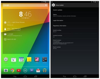
Android 4.4 KitKat on Nexus 7 and 10 doesn’t come with Google Experience Launcher
With the Nexus 7 (2012/2013) and Nexus 10 now receiving their Android 4.4 KitKat updates over the air, some of you might notice that your homescreen is just a tad different than what we saw on the Nexus 5. Specifically, the absence of the Google Experience Launcher (or as I refer to it, the Google Now launcher).
Looks like Google is pulling the switch-a-roo, opting for the good ‘ol fashioned 5-screened layout in the Nexus 7 and 10. Gone are GEL’s infinite homescreen pages and trademark transparent app drawer and system bars. They’ve all been replaced by the traditional solid black bars and drawer we’ve seen since Ice Cream Sandwich.
We’re guessing the reason Google went this route was due to differences in hardware. The “always listening” Google Now search bar in GEL probably required optimizations found in the Nexus 5’s Snapdragon 800 CPU. But then again, why not at least add the fun new transparent bars?
If you think about it, it almost seems like Android tablets are getting a more “stock” version of Android 4.4 KitKat than the Nexus 5. Anyone upset that their tablet’s homescreen wont be infused with Google Now goodies? Protip: Nova Launcher’s latest beta still provides transparent system bars.
Images via: Reddit