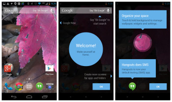
How to rearrange the Google Experience home-screen on the Nexus 5 with Android 4.4 KITKAT [VIDEO]
While Google’s basic home-screen has traditionally consisted of 3-5 panels, the new Google Experience launcher — the one that includes a Google Now pane on the far left — allows you to add as many as you want, as well as rearrange them however you want. Some folks were a bit confused by how to do it, as this option in custom launchers is typically found within a daunting settings menu.
Thankfully, Google made it intuitive and easy to add and rearrange panels using nothing but gestures. You can find out all the deets in the video above, but if for whatever reason you can’t watch it then be sure to look below for instructions on the various actions available to you.
To add new panels
This is going to be one of the more confusing ones, as this is something typically done in a settings menu for traditional custom launchers. If you want to add a new home-screen panel, simply follow these easy steps:
- Open the app drawer
- Find the icon of an app you want to place. Hold down on that app until the interface for placing it pops up.
- Instead of dropping the icon on the available home-screen panels, move your finger all the way to the right edge of the display. Keep it there until you reach the end of the list. A new, empty panel should show up. Drop the icon there.
And there you have it! You can add as many panels as you’d like (we’ve been able to add as many as 15 so far!), so go nuts with whatever you want to do.
To remove panels
To remove a panel, simply remove all icons and widgets from said panel.
To add widgets
Hold down on an empty area of any home-screen panel. At the bottom middle, you should see an icon for widgets — press it. Find the widget you want, long-press on it, then drag it to any home-screen panel that has space (or add a new home-screen panel as detailed above).
To rearrange panels
To rearrange panels, hold down on the background of the launcher. From here, simply long-press one of the panels and drag it to whichever position you want. Remember that the far-left panel will always be the default “Home” panel (so if you’re on panel 4, pressing the “Home” button will take you back to that panel). Unfortunately, there is no way to delete an entire home-screen panel without the method listed above.
Tada!
And there you have it. Some of this stuff may be trivial to some of you, but considering this is the first time Google has given us this level of customization for the default home-screen we wouldn’t be surprised to learn that many others are confused.
Google’s new launcher doesn’t quite stack up to the competition which often provides much more flexible and useful options, but this isn’t too bad for their first shot. There’s still some work to be done yet, but with future updates this could be one very sweet launcher. Be sure to watch the video above if you are more of a visual learner than anything else.
