Samsung Galaxy Note 10.1 (2014 Edition) Review
The Samsung Galaxy Note 10.1 – 2014 Edition and the Samsung Galaxy Note 3 (read the review) share more than just a joint announcement in common. While both are iterative upgrades from their predecessors, the upgrades are huge across all facets of the devices, enjoying large leaps in build quality & style, hardware & specs, and software & features.
But is the Galaxy Note 10.1 2014 Edition worth your hard earned money? Read on to find out!
Galaxy Note 10.1 Hardware
The smartphone and tablet market has largely matured, so new devices in a series tend to see smaller upgrades and improvements, bringing their offerings on par with the competition. The Note 10.1 doesn’t look a whole lot different, but picking it up and powering on the screen will be a pleasant surprise to those who have used last year’s model.
The two most visually recognizable improvements are in build quality and screen resolution. The Note 10.1 2014 simply feels like a more sturdy, strong, premium device than in previous years. It’s a solid piece of kit with a screen boasting a 2560 x 1600 pixel resolution, doubling that of last year’s 1280 x 800 display. Better screen, better hardware, packed into a thinner design with smaller bezels.
Let’s take a look under the hood:
- 1.9GHz Exynos 5420 quad-core processor
- 3GB of RAM.
- 16GB or 32GB options for internal storage
- 8MP rear camera
- 2MP front facing camera
- MicroUSB 2.0
- MicroSD slot
- 8,220 mAh battery
- Android 4.3 with TouchWiz and S Pen customizations
- Dimensions: 243.1 X 171.4 X 7.9mm
- Weight: 535g
Definitely a solid set of specs on par with the improvements to the Note 3. The quad-core processor with 3GB of RAM is a healthy amount of power and the 8,220 mAh battery should support plenty of usage for one cycle.
The Note 10.1 is constructed beautifully, but I wasn’t crazy about button placement.

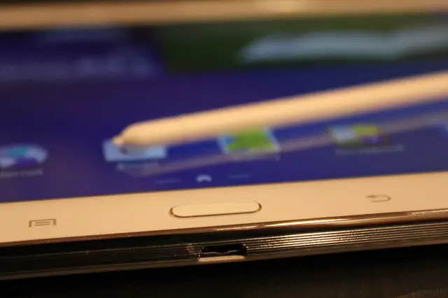
The device now has a “Home” button, with menu and back buttons on either side, suggesting the device is best used in landscape mode. That places the power button on the top left, next to the volume rocker which rocks left/right. I’d much prefer these buttons on the side for a tablet, preferably as far north as possible to prevent accidental input while using the device.
The speaker grills are on the top left and right of the device, which I found myself accidentally covering at times, muffling the sound. I’m still a firm believer that speakers should be tastefully mounted on the front of the devices, successfully done on devices such as the HTC One, perhaps with non-essential 2nd and 3rd speakers on the left and right for stereo sound.
Those nitpicky complaints aside, the Galaxy Note 10.1 is a pleasure to hold. It feels firm and solid, with the new faux leather back offering a luxury feel that’s been missing from Samsung devices (even if it is still plastic).
Unlike the Note 3, the Note 10.1 doesn’t get the upgrade to MicroUSB 3.0 and sticks with the traditional MicroUSB 2.0 port. Some may put this in the downside column, but I’m content with the 2.0 port. Elsewhere on the exterior you’ll find an IR Transmitter on the top, 8MP camera with LED flash on the back, and the MicroSD slot on the right.
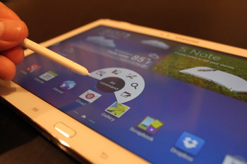
Of course we can’t forget the S Pen – integral to the Note 10.1 experience – perched on the upper right of the device.
The Galaxy Note 10.1 has all the makings of an impressive device – and it does impress – but I never would have guessed that the quad-core processor and 3GB of RAM would be to blame for the less than stellar performance of the Galaxy Note 10.1 Software.
Galaxy Note 10.1 Software
Samsung is the only big name player developing quality hardware with stylus support. With the Galaxy Note 10.1 they’ve taken their lead and doubled it, building a load of new S Pen features and improving on existing features that truly make the tablet and stylus experience a pleasure to use.
Multitasking with Multi-Window
With 10 inches of screen real-estate, you’ve got an awful lot to work with, why not take advantage of it? Multi Window lets you turn your tablet into a dual monitor experience, splitting your display into two panes and actively using both simultaneously. This feature is great on the Note 3 but amazing on the Note 10.1.
It isn’t new to the Note 10.1 but comes with improvements that make it even better. You can now slide the dividing line between each pane to change exactly how much screen real estate is reserved for each activity. Pressing the blue middle button also gives you some shortcuts and you’re able to “favorite” a combination of windows for quickly opening them in the future.
I had five favorite combinations to which I kept returning:
- Hangouts video call & Chrome
- Hangouts video call & Maps
- Chrome & Youtube
- Chrome & E-Mail
- Youtube & E-Mail
The feature is productivity heaven and supports a growing list of apps, which are automatically loaded into the multi-window side panel when they’re downloaded. As more apps become compatible this feature will grow in value.
Air Command with S Pen
Pulling the S Pen out of its cradle or pressing the S Pen button when in close proximity to the screen will pull out a circular menu (called Air Command) with 5 options:
- Action Memo: quick post-it-note style memos with added functionality.
- Scrap Booker: circle multimedia from any screen on the tablet to organize multimedia snippets into a categorized scrap book.
- Screen Writer: get a screenshot and doodle whatever you want on it for saving or sharing.
- S Finder: universal search to locate anything from your device, the web, personal accounts, and more.
- Pen Window: quickly pull up a hover-over-the screen app such as Calculator, Alarm, Youtube, Contacts, Web, Hangouts, etc… easily moved, expanded or minimized.
While I found Pen Window almost useless on the Note 3 it was promising on the Note 10.1 due to the added screen real estate. It’s essentially a freeform version of Multi-Window albeit with a more limited menu of apps. It would be great for quickly finding contact info, performing a calculation, watching a video, or performing a video hangout while multi-tasking, but Pen Window was one of the unfortunate victims of the Note 10.1’s performance issues.
Action Memo, Scrap Booker, and S Note are all useful tools but splitting them into 3 different apps with 3 different layouts serving 3 different purposes makes things a bit confusing. I’d prefer to see one “S Note” app with Action Memo and Scrap Booker features, elegantly designed into a much simpler interface.
Performance Problems
Here is where things get inexplicably iffy. Although the Note 10.1 is packed with a quad-core processor and 3GB of RAM, there is noticeable lag when using the device across a number of apps and instances, mostly while multi-tasking. Nowhere is this more noticeable than in “My Magazine”, a new 10.1 feature that is powered by Flipboard and accessed by swiping up from the home screens.
Ouch. That’s pretty awful. But while the Note 10.1 definitely has performance issues that we’d like to see corrected with a software update (if that’s even possible), it seems the My Magazine problem is attributed more to Flipboard than Samsung.
And the somewhat infamous “Gallery loading” problems? I didn’t experience them at all.
Still, it’s disheartening that the 10.1 will trickle out with less than stellar performance despite it’s towering spec sheet., landing among the top tablet offerings, but not above them. These mysterious performance issues, when coupled with a hefty price tag, make it difficult to recommend the Note 10.1 without hesitation.
Camera, Multimedia, Battery, Beyond…
Public Service Announcement: you should NOT be walking around with your tablet and using it like a DSLR when on your latest vacation. You’ve got a phone, with a much better camera, sitting in your pocket, and it will make you look a lot less ridiculous. Personally, I wouldn’t mind if tablet manufacturers did away with rear cameras completely.
But the camera is there so we tested it out… here are a couple samples:
The camera performs okay and just okay. Pretty good when the lighting is good but only okay in low light and directly bright light, where images tend to be washed out. But you’re not buying the tablet for its photographic prowess, so consider the camera’s existence an added benefit.
From a multimedia standpoint the Note 10.1 is a gem. Web browsing, video playback, together with the multi-tasking features such as multi-window and Pen Window make the Note 10.1 a brilliant device for multimedia. The improved screen is noticeably more enjoyable and just an all around pleasure to use. The speakers are L-O-U-D, sound great, and could only be improved by relocating them to the front of the device.
The huge display, gobs of multi-tasking, and powerful processor should weigh heavily on the battery. They did, but I’d consider the Note 10.1 battery to be above average. While testing the tablet I pretty much pounded every feature – music, videos, apps, games, web browsing, downloading – you name it. The Note 10.1 could typically last an entire day even with hardcore use.
The S Pen Dilemma
This problem isn’t unique to the Note 10.1, affecting any 10-inch tablet with a stylus, but it was enough of a frustration that I believe it’s worth pointing out.
When you’re writing with the S Pen, you’ve got no choice but to hold the tablet with one hand. Despite it’s relative slender frame, the 10.1-inch tablet is too big and heavy to hold steadily for any prolonged amount of time, making use of the stylus unproductive and uncomfortable for any period of time over a couple minutes.
I’ve concluded that the Note 10.1 with S Pen is best used in one of several situations:
- You’ve got a desk on which to lean the Note 10.1.
- You’re sitting and can place the Note 10.1 firmly in your lap.
- You’re using the Note 10.1 but not the stylus.
- You’ve got gargantuam hands and can palm the Note 10.1 like Shaq can a basketball.
Just a heads up: keep this in mind if you’ve never owned a device with this form factor and have some assumptions on how it would fit into your daily routine.
Verdict
While other companies are offering stylus support as a replacement for your finger, Samsung is creating deeper experiences that extend the user’s capabilities. That’s the strength of the Galaxy Note 10.1 and if you’re a must-have-stylus type of person, this is your device.
If you’re just looking for a great tablet, the price and performance issues make devices like the Nexus 10 more attractive alternatives. If you’re somewhere in between and can wait, keep an eye on a potential Note 10.1 software upgrade that fixes performance issues, otherwise opt for one of the newer tablets sure to be announced in the next couple months.
Positives:
- Beautiful screen
- Solid, well built hardware
- Visually attractive
- Multimedia and Multitasking powerhouse
- Stylus featutes that far surpass any competitor
Negatives:
- Performance issues that cause lag
- Priced high relative to non-stylus competitors
