
While the Ookla SpeedTest app for Android has been reliable over the years, it flat out sucks. It’s ugly, the user interface is outdated, the graphics are broken, and it hurts my eyes. Thankfully, that should all be rectified at some point this week.
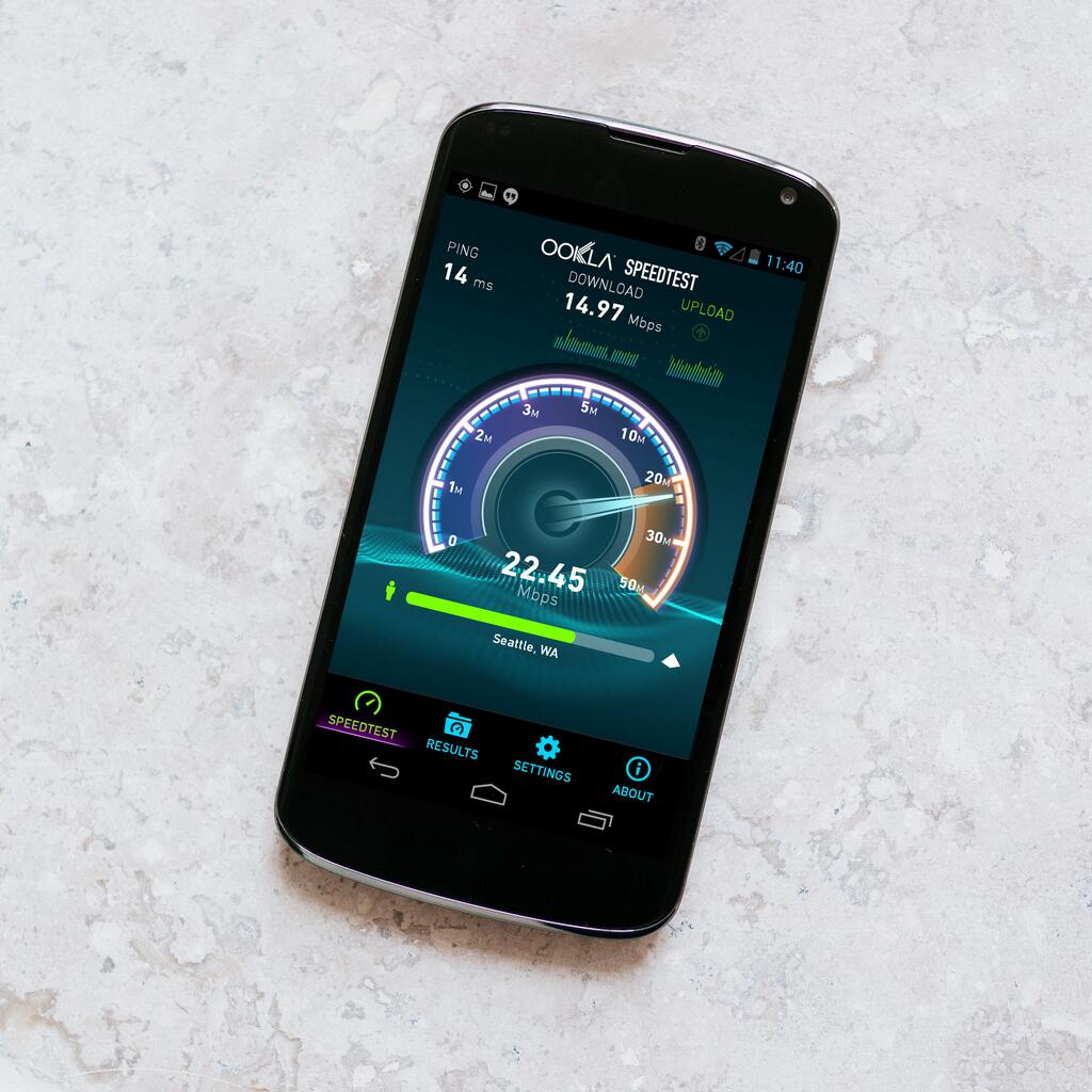
Ookla is teasing SpeedTest 3.0 on Twitter. The company didn’t give many details in terms of new features, though they did give us a quick look at the user interface you’re presented with when starting up the app. If any of you have ever used the iOS version of Ookla, this looks pretty much identical. Those Apple folks have been enjoying it since March, and we’re glad Ookla finally stepped up to the plate to deliver the same tender love and care for us Android users.
All Ookla said in terms of a release was “this week,” so we’ll certainly be on the lookout for it as the days move on. In case you’re wondering if I’m exaggerating about the ugliness of the current app, give it a download in the Google Play Store and take a look for yourself.





Maybe they’ll also optimize it for tablets?
Finally, hopefully they fix the scaling for HD devices too
Did they finally fix the screen issues with bigger screen phones? got a N4 w/ wasted space on that app
I would think so. That’s a Nexus 4 that is in the picture.
Or is it the Nexus 5?
Definitely the N4
Yup. I have the N4 and I can confirm that its just an N4.
About time!!! Even Windows Phone had it before us!
So they’re fixing the screen scaling issue… is this really that big of news? Are they giving us new features or anything? That’s worth getting excited about.
att lte is twice as fast as my xfinity according to them.
All I have to say is its about damn time.
About time! It’s tiny on high res devices.
They’ve had that same interface on ios for months now almost a year, I appreciate them bringing it to android but damn at least make an effort to do it on a timely fashion, we are not second class citizens. Same for Facebook (I know who cares) well lots of people use it like myself, as soon as ios officially came out it was available as native as it gets, yet we have been stuck on the old version for decades.. *end rant *
While from time to time I’ve noted the graphical difference between it on my S4 and my iPad 3 and I welcome the updated graphics. The old graphics seemed fine and usable
Thumbs up!
i dont care much for graphics…as long as it is accurate and reliable…im good.
Exactly
On my HTC One, the “Start” button would overlap the actual dial. It looked horrible. It was right, I guess, but then I was able to click the “Start” button while it was doing the test and that would mess things up. =.=
Yea, I don’t think you realized all the horror some people may have gone through. Oddly that only happened while I was connected to LTE. LoL!!
I thought they forgot about the app. LoL!! I was like this is getting bad. It was pretty bad on my HTC One, while connected to LTE for some odd reason.
The start button stayed on the screen. It was so weird. And it was clickable which would restart the test and the previous test would keep going. I was like WTF!? LoL!!
And on tablets it’s all small and stuff. I was like “okay”.
It’s not necessarily ugly .. it’s just that the animation of the needle was garbage compared to how the iOS version looks. Hopefully 3.0 will finally match it up.
I stopped using it on my phone in favor of RootMetrics coverage map for the added benefit that it is auto reported, at my request, to Tmo, and Tmo has made it not be part of your data allotment, on network or roaming. The expanded the bandwidth of a tower a block from my home, and I believe that is in part because my wife and I have reported thousands of tests showing the issues in peak times.
On the topic though I’m excited and hopeful for my N7 as it looks nasty on it currently.
Only thing I’d like is a tablet version and a f**king cancel button during the speed test. Oh, and I’d throw down a couple bucks for a paid, ad-free version as well.
While I agree it’s due an update, I’m opposed to calling it ugly.
It might not scale right, the GUI is fine and looks far better than many newer apps.