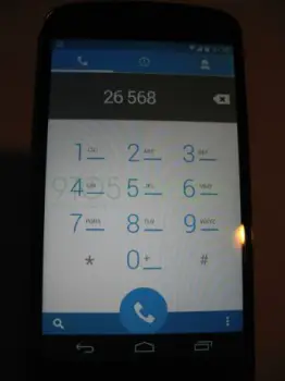
New Android 4.4 screenshot leaks reveal redesigned messaging, dialer apps and more theming
I personally like the new look of the dialer app, since I prefer lighter interfaces. There isn’t much to say about the messaging app without seeing the way a thread looks, but considering it’s Google, I think it’s safe to say it’s going to be neat, tidy and gradient-free.
Also, it looks like the theming capabilities we had been expecting in Android 4.4 won’t be restricted to just the manufacturer or the user, but individual developers too. You can clearly seen in the images that the notification bar is a dark shade of blue in the dialer app and green in the messaging app.
As a developer myself, I would definitely enjoy the ability. Even though it’s only a few more pixels, it does seem to give your app a more immersive experience of having taken over the entire device’s screen, without harming the user experience of the notification bar.
One particular aspect of the message app that caught my eye (and I’m probably just reading a bit too much into it) is the notification bell in the center of the screen of the messaging app. You know you’ve seen it, but can’t put a finger as to where? It’s there on your Google+ notifications bar on the web and in your app. What I’m wondering is whether this little guy is an indication as to a Google+ Hangouts/Messaging app integration.
Remember, that is a wild guess based solely on the presence of that bell. I do realize that if it were a Hangouts app, we would see the Hangouts icon and name in the ActionBar, but I’m not quite sure why Google would place their own little “mascot” of sorts in what is meant to be a brand-free AOSP app.