Show us your home screen setup! [LABOR DAY EDITION]
Happy Labor Day, folks! While a lot of Americans are busy barbecuing and enjoying one of the last holidays of the summer, we imagine some folks have spent their free time today to change their home screens up. The last time we did one of these, I showed you guys my pathetically simple setup.
It was, quite simply, one of the most unimaginative, uninspiring home screens of all time. (Edgar and Chris also didn’t walk too far on the wild side.) I vowed to come back strong in a future episode, though, and while my changes still might not impress the most creative folks out there, it’s certainly a huge step forward for me.
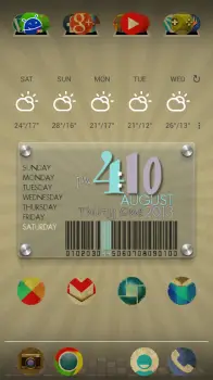
This time around, I downloaded the Vintage icon pack for use with many modern launchers such as Apex and Nova. I love a good washed-out, torn, ripped, worn, and weathered look, so this was a no-brainer for me to apply once AndroidForums.com user Cincybearcatfan recommended it for me.
For my clock widget, I installed One More Clock Widget, and used one of the many pre-installed custom clock/date/weather/battery widgets it came with (the one shown above). I’ve since customized the colors and arrangement a bit more, but that is pretty much what it looks like as of the time of this writing. I used the Eye in the Sky weather widget / app to give me that clean weather widget you see above the clock (and the weather app that sits behind it is quite beautiful and functional, might I add).
As for my launcher settings, I’ve shaven the number of home-screen panels I have down to one — no scrolling left or right for me. As you might notice, I have also hidden my status bar and gotten rid of my apps tray button. Instead, I opt to use the swipe down gesture in Nova launcher to bring up my notifications, the home button while on the home screen to bring up the apps tray, and swipe up to access my Google Search / Google Now.
And since I love Halo, but I’m not on a ROM based on Paranoid Android, I’ve used Floating Notifications to get a quick look at my notifications while I’m on the home screen. It’s not quite as good as the implementation of Halo, but it does the trick just fine.
The setup is a bit unconventional, but that’s the joy of Android — it’s made for people who like to be unconventional. Be sure to show us your own home-screen in the comments section below, and let us know what you used to make it all happen!