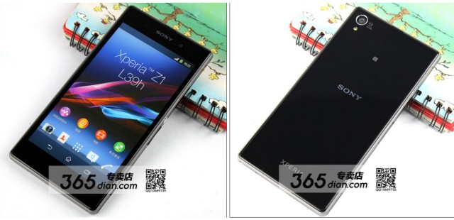
Sony’s had a hard time keeping the Sony Xperia Z1 (Honami) under wraps. A supercharged refresh to the original Sony Xperia Z that launched only earlier this year, the device has been leaked more times than we can even count. More recently, Sony’s been gearing up for the device’s official unveiling (set for next week), teasing the device on the usual social networks by showing off tightly cropped images of the device’s camera and buttons. There was even a very sexy teaser video uploaded to Sony’s YouTube channel, which you can find below.
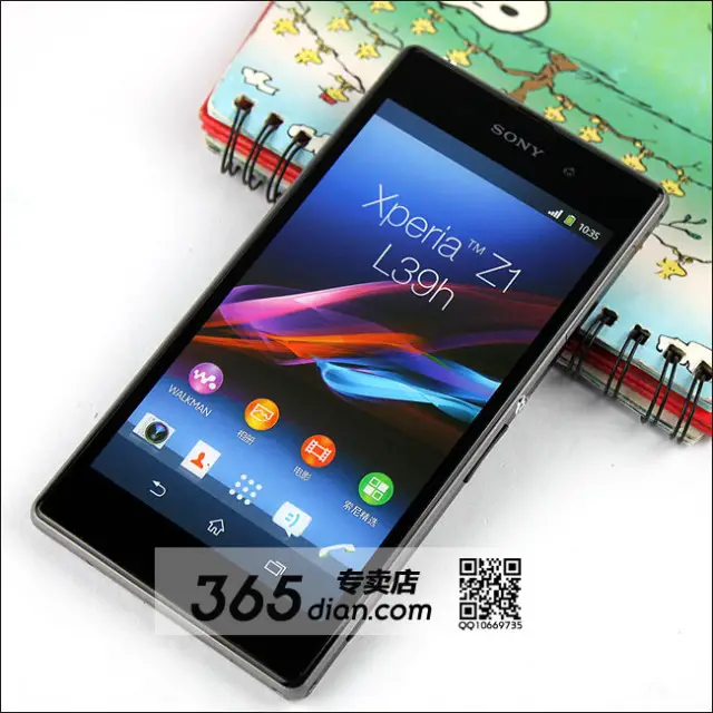
We’ve had a pretty good idea that the device would share many of the same design cues as its predecessor — thanks to numerous blurry cam leaks in the past — but this latest leak is giving us our clearest look yet at the device yet. Photos of a few Xperia Z1 dummy units were snapped up by 365dian, and show us every corner of the device in brightly lit, plain view.
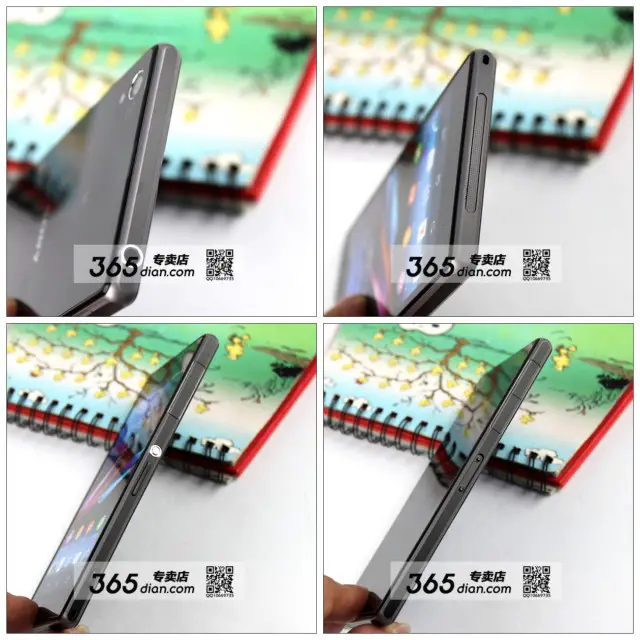
As a refresher, the Sony Xperia Z1 is said to come equipped with Qualcomm’s latest Snapdragon 800 processor, a full HD 1080p display, 20MP G-Series camera that is capable of recording video in 4K resolution. A smaller version of the Honami, codenamed “Itsuki”, is said to also be announced during Sony’s Sept 4th event, packing the same camera, only in a smaller 4.3-inch 720p display package.
With so much amazing Android hardware being announced announced in the coming weeks, the only question is which will be first to market and which device your wife will allow you to splurge on.



To much bezel
So you like all that bezel?
Doesn’t look much more than what the HTC One has. Plus, Sony’s has the soft keys on the screen (which is a plus) versus One’s hard keys.
Agree. Aside from that, when holding the phone in landscape, having a little space on the sides is a bonus to keep your paws out of the viewing are.
Why doesn’t Sony or someone just ship stock Android? Instead, they have an army of internal developers dedicated to mostly making the OS worse.
I don’t get it.
Well, if all Android devices ran “stock”, what would separate them from the other guys? Don’t forget that Google gets a lot of great feature ideas from manufacturer UI’s, which they later incorporate into AOSP. UI’s aren’t entirely bad.
I just wish they put a bit more thought into making everything work right.
The best innovative hardware combinations.
They could do a different camera app with more features, custom widgets, even a different launcher that it’s easily replaceable.
But why change the whole notifications panel with ugly colors or the settings menu in the same way that look like 2.2 is back? Why create a phone, calendar or messaging app that have noting in common with the rest of the phone looks? Most manufacturer’s UI have a very poor consistency at least.
I like the way that Motorola is changing their UI. Stock JB looks with many more features but still holo
Consistency comes from believing in the original UI’s principles. It’s hard to do that when you want to stand out.
Perhaps Android should have a theme engine so that all your apps would look like Samsung style, HTC style or any style you want instead of all these Holo apps looking out of place in a Touchwiz dominated world.
What separates Android phones for the average user (not us) is likely what’s new that the carrier is selling at a given price point. That’s all I see from typical users.
1. Hardware would separate them.
2. Faster updates would separate them.
3. Differentiation would separate them (as no one besides the Moto X is even trying to ship stock)
Well Oppo will be shipping their new phone that can dual boot their own overlay or just stock. That would be an interesting solution, but what you’re suggesting isn’t really necessary. If everyone released stock Android, how would they differentiate from one another? Then you have to consider, not many people really care whether or not it’s stock, the features of Touchwiz, Sense etc. are the selling points.
The Sony UX skin is really good.
stock notifications and settings menu sucks, its so monotone, ugly and empty. and i love android. I love the dialer though.
Always loved the design Sony uses, the problem is they never come to Verizon. I get the feeling this won’t either.
The exposed headphone Jack makes me think it won’t be waterproof :(
But they show it under water in the promo vid above…
it will be. It is not hard to seal the casing for the headphone jack inside the device. It is more reliable than just plopping a plug in the jack.
Yeah. I only wish they would have had this refinement ready for the Z. That’s really the only thing that irks me about my phone. I have the charging dock so the usb flap I hardly ever deal with, but the headphone jack, frack it’s annoying. Worth it for the waterproof though.
Too much bezel with ugly onscreen buttons making the screen look even smaller than it is
4.3 inch screen ?? I’ll pass, 5inch is the sweet spot
the article says two versions are coming out, 4.3 is a smaller version to follow
Lots of people want a smaller phone. But they don’t want a smaller phone with weaker specs.
This is 5″.
I want a 5″ screen Honami in a compact form factor about 135mm tall.
Way to much bezel!?!
Sony never does thin bezel design on phones yet…
They did a good job with the Xperia ZL putting a 5″ screen on a device <132mm tall. I was at least expecting the Xperia Z1 to be <137mm tall.
Whose bezel do you prefer?
Stupid comment system
Not sure why Sony wants to focus on that power button when LG and Oppo are coming out with buttons on the rear, which is the most elegant aesthetic approach (perfectly symmetrical with smooth sides). A minor quibble to what is otherwise such a nice looking phone.
Power button on the rear wouldn’t worrk with the detatchable camera lens doo dad they have planned for this thing.
Sony is now really stepping up their game.. I remember 2 years ago, every Android device they release is outdated.
Now.. it’s game on!
Let the healthy competition begin!
Yeah imagine if Xperia play had those specs. It would kill Vita but better if Sony were to do it than Apple
Usb charging port cover is a hassle.
there is no port covering the charging port. its on the left side like on the ultra. it’s a magnetic charging port
Is it just me or does every Sony device after the Xperia Z look exactly the same ? At least change up the design a bit
you mean they have a “family” design for the season, like car makers or any other product trying to have a season and family “look” – the last thing they want to do when they are releasing 1 product at different price / spec points is have a completely different look to them!
Look at other manufacturers, I mean the Samsung Galaxy S3, S4, Note II, Note 8.0, Galaxy Player totally don’t look the same..
Oh wait..
The galaxy s3 and s4 don’t look the same, the s3 is more rounded on the sides and even on the top and bottom, the xperia devices on the other hand look exactly the same its hard to differentiate between them.
I don’t really care what it looks like, I use a case on all my phones, that is where you can be individual. I just want power specs and functionality
When you think about it dont all phones look alike to some degree?
You’re right the specs are more Important but I was just hoping they would refine the design a bit, like an edge to edge display
Maybe on the next one. This phone is all about the camera, and you gotta have somewhere to put your fingers thats not on the screen. I didn’t like the xperia design at 1st but it grew on me
I like the specs, but I really don’t like the sharp looking corners.
BUT the phone is super light so its having sharp edges wont irritate your hands
I want one. Holy crap, do I want one.
But they’ll have it released on Cricket or T-Mobile or some other carrier that doesn’t matter.
*sigh*
This will not be available at Cricket.
-Someone that is privileged to this info
You’re comparing cricket to T-Mobile? Your disqus account should be banned.
If it comes to America I hope it includes a flash player. Otherwise I’m impressed the rumored specs.
A magnetic charging port should be a standard, no it sounds like a genius idea
Those specs in 4.3in I’ll be getting one.
Does anyone know if this going to come out in the US? this phone is by far king of the flagships
4.7 to 5″ screen with thin bezel fits nicely in a pocket. I’ll pass on this phone.
Hoping this gets released soon, would be my next.
I hope this promo is run in the Americas :D
http://thedroidguy.com/2013/09/xperia-z1-pre-orders-in-the-uk-will-get-a-free-sony-smartwatch-2/
In my opinion, the bezels are just fine. Bezels that are too thin can present a problem when being grasped. If the screen is too close to the edge of the phone, the display may make unwanted contact with your hand. Bezels do serve a purpose.