
Design Love: Yahoo! Weather
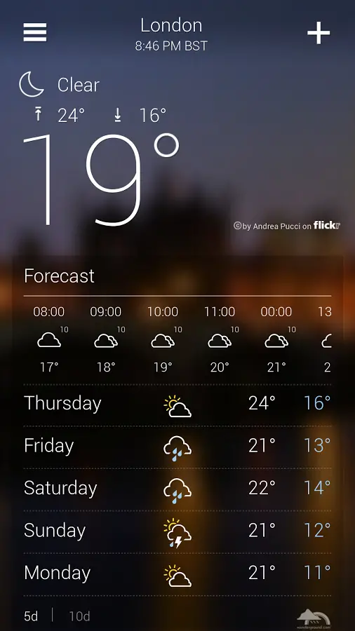
I, for one, am glad to see the increasing positivity around Yahoo. Ever since Marissa Mayer was appointed CEO a little over a year ago, the stock is up over 80%, several acquisitions have meant they’ve added interesting products like Tumblr as well as top-notch developer teams and Flickr looks like something worth using again. And, if the Yahoo! Weather app is anything to go by, someone there seems to know how to put together a decent design again.
Back in June, Apple awarded Yahoo its prestigious Design Award, saying:
Yahoo! Weather stands apart with its simple, uncluttered, and beautiful visual design. This highly-rated app displays weather details with stunning photography based on time of day, location, and current conditions. Yahoo! Weather has great layout and typography, compelling animations, fast image processing, and clear iconography. This attention to detail means that in a saturated category, an app can rise above the crowd.
Android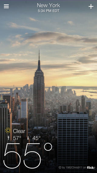
Three days ago, Yahoo brought the same interface to Android. Yep, the exact same interface as these screenshots show, which has already brought up an interesting debate regarding the pros and cons of it. Matias Duarte wrote this post yesterday, sharing his opinion, and it’s well worth the read. This paragraph, which indicates Google’s position on their suggested design guidelines, is something that stuck with me.
Consistency and conventions are there to help your users. They help users get things done and not worry about how to get things done. Design guidelines are there to help you understand the consistency and conventions, especially if you’re not from around here.
My thoughts? The app is gorgeous, and besides the pull-to-refresh which I felt had discoverability issues, there isn’t much wrong with it. Except that Android isn’t iOS, and bringing together some beautiful photos from Flickr to be front-and-center of your UI is not enough to differentiate yourself in a saturated category. On Android, one thing will always remain key: functionality.
There are several apps that already match what Yahoo Weather does, and then beat it with their additional capabilities. For example, Beautiful Widgets allows you to customize your homescreen widget to your exact taste, and Weatherwise allows you to purchase some really cool animated skins that have a 3D-like experience. My personal preference is for 1Weather because it connects with DashClock.
I do suggest giving Yahoo! Weather a try. Like I said, it does look really good, and doesn’t deviate too much from Android’s guidelines to be an issue. Having said that, I don’t think they’d win any awards on Android, but I’d like to see them keep trying and improving.