[Opinion] What an ideal smartwatch should be like

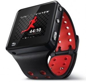
Smartwatches seem like all the rage right now, and I am extremely excited about the future of them and wearable computing in general. I have spent about a year using the Motorola Motoactv, and it has become almost as close to me as my phone. My primary use case for the device is that of a fitness tracking device, but what I really wanted to do was explore the possibilities regarding how such a watch should work.
The key advantage that the smartwatch platform brings is giving developers the capability to add another key element to the experience their mobile apps provide. I personally see the platform as being capable of providing most of the advantages of Google Glass, with significantly less intrusion.
While they have been around for a couple of years, I believe that the reason we’re seeing so much interest around the topic is that, finally, we seem to have the right set of software and hardware features available to create a truly exciting device. We still haven’t seen one that checks all the right boxes (I was disappointed with Sony’s latest effort).
What are the key factors to me for the first “successful” smartwatch?
Physical Buttons
This might seem a little strange as the first thing on my list, but in my experience with the Motoactv, I have often found that the hardware keys are central to many aspects of the UX. A touchscreen should be there, of course, but several of the “key functionalities” should be controllable by physical keys.
The Motoactv gets this perfectly, with a single button-press required to start music playback, controlling the music via the volume up and down keys, and also launching the fitness tracking app with another dedicated button. It also switches on the screen if you shake your wrist, which is an extremely natural gesture for long-time watch-wearers.
In a consumer-version of the device, however, I believe the fitness button should be replaced by one that quickly takes the user straight to the notifications, or better yet…
Voice Controls
As you can imagine, the worst part of a smartwatch is using it for any kind of input. While developers should focus on building some kind of bridge between the watch and their mobile app, so that the mobile app basically configures their watch app for things such as logging in and settings, a true smart device will need the user to interact with it often.
A button press or some other quick gesture should be the equivalent of nodding your head with Google Glass before saying “Ok Glass, …”. In fact, if Google were to release a smartwatch, I would be very, very surprised if voice interaction nearly identical to what we’ve seen so far in Glass doesn’t make it to the watch.
Ability to swap straps like any other watch
A watch, regardless of how much additional functionality it contains, will always be an important accessory in the user’s wardrobe. Smartwatches already struggle with limitations as to what the watch itself can look like, since where a designer of a normal watch would work hard at designing a dial, all they can really do is put a screen.
However, they don’t look…. bad. On more than a few occasions I’ve been complimented by others for the Motoactv, and these are people who didn’t know it was anything more than another watch before they said what they did.
This might feel like asking for too much, considering how important add-on accessories have become as a revenue source. But for mainstream popularity, a smartwatch can no longer take the Motoactv route, which can only be attached to a their black strap. It works, and the strap is of pretty good quality, but I’m certain a lot of people wouldn’t mind keeping a couple of extra-color bands with them.
Vibrator
The omission that I missed the most on the Motoactv was that of a vibrator, so that the watch could notify me whenever I got calls, texts, etc. With no speaker either, it meant that I was reliant on my phone for being alerted to notifications. You can make do without it, but you really shouldn’t have to.
Colored screen
I really had to debate with myself about this one, and I’m still not certain about which way to go: a colored screen that offers poorer visibility and battery life, but, well, colors, or E-ink? While a lot of people would lean towards the latter, my belief is that the colored screen, even with the shorter battery life, would win over more of the general populace.
I can easily get through three days with my Motoactv, if not more, so I don’t personally see it as a major problem. That also gives me greater freedom when it comes to designing custom dial for the watch, something I have enjoyed to quite a degree with the Motoactv. The only usability loss that I see is that the screen cannot always be on like it is for the Pebble, which uses E-ink. I am personally fine with the shake-to-wake gesture, so it’s a sacrifice I’m ready to make.