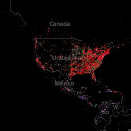
iPhone vs Android users visualized by geographic location
If you ever needed a visual representation of how Android is doing when pitted against, say, iPhone or BlackBerry devices, the folks at MapBox got your back. These guys found a way to use the raw data from Twitter to track 3 billion tweets sent from our Androids, iPhones, BlackBerries. When placed on a map of the globe by color, you get an interesting visualization of the current state of our mobile holy war.
It’s really no surprise that BlackBerry is all but non-existent (although, still thriving in Mexico). Don’t be alarmed if it appears that there’s an awful lot of red with only tiny bits of green, keep in mind red is merely drowning out all the other colors. Turn off the iPhone, and you’ll notice a whole lotta green.
Keep in mind this in no way definitive, it’s limited only to Twitter users and the device they’re using. If you’re curious to see how the mobile wars are faring in your area, hop onto MapBox to see for yourself. I have the strong urge to play Ingress all of a sudden…