Hands-on: Minuum Keyboard, does it live up to the hype? [VIDEO]
There was a lot of hype surrounding the Minuum Keyboard Project, ever since the virtual keyboard sought funding from Indiegogo back in April. Since then, the keyboard app went well above their meager $10,000 goal, and developer Whirlscape managed to raise a whopping $87,000 in cash. Yeah, people were excited about.
The Idea

I know, I know. We’ve seen the claims before: the modern QWERTY keyboard is as old and rusty as the typewriter, and something needs to be done about it. The thing is with Minuum, lead designer Will Walmsley wasn’t trying to reinvent the QWERTY layout — simply tweak it. For the small screen.
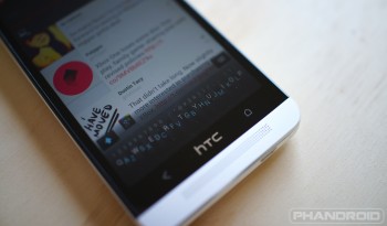
What they’ve come up with Minuum is a minimal, unobtrusive keyboard that only occupies a single row along the bottom of your phone. If you look closely, you’ll find the traditional QWERTY layout within, only now it’s super tiny. Essentially you type as you normally would but instead of changing rows for different letters, they all occupy the same single row. Spaces are executed by swiping forward, and deleting words are as easy as swiping the other direction. Pretty straight forward.

Pitfalls
In my time with Minuum, I found a few issues with the keyboard. First off is when you type with heavy slang or make up words. When I type to my mother, I use the Queen’s English but when talking with my peers, “Oh, hellllll naw, bruh!!! All that goes out da window.”
The nice thing about Minuum is it will “learn” common words much like other keyboard replacements, but typing out email addresses or proper nouns kills so much time, it’d be faster to pull down the notification tray and switch to another keyboard. Also, I get the idea that Minuum is meant to save screen real estate, but is that really necessary with 4.7-inch+ smartphone displays? I admit, this would work great on the G1, or smartwatch, or any other mall screen where the hands of an elf are needed, but I found it almost… pointless on my smartphone.
In landscape mode it seemed to work well enough, allowing you to see more than just the text box. But throughout it all, I was still asking myself the same question, “Is this really worth it?” The answer, for me anyway, was always — no.
Verdict
Keep in mind I’m not saying Minuum keyboard is bad by any means. In fact, if they merely had an option to use it in a standard 4-row QWERTY layout, I might have made it my new default. The spot on corrections with sloppy typing might have only been matched by veteran keyboards like SwiftKey. That being said, I think Minuum a great idea, just one better suited for the small screen (like, really small screen), not our modern full sized Androids.
If Minuum intrigues you, make sure to head on over to the official website. There you can sign up to help test the app once the open beta is available.
