Buyer’s Remorse: HTC One, iOS 7, and back again
Rob has loyally covered iOS topics for several years at iSource.com, but with the HTC One in hand and a smile on his face, he is welcomed to Phandroid as a brand new Android enthusiast.
HTC One purchase
Two months ago I set off on an experiment to see if I could make my first Android phone my daily driver. Up to this point I had been a proud iPhone user for the last 6 years, owning all but one iPhone iteration. However, this year seemed like a great opportunity for me to try something new. iOS 6 had become a little stale and boring for me. I expected Apple to release the iPhone 5S this year, with little or no change to the exterior of the phone, and HTC had just launched their new flagship device the HTC One. I sold my iPhone 5, and bought the HTC One the next week.
My transition to Android wasn’t nearly as unnerving as I thought it might have been. Sure, there were the missteps along the way — like my unexpected issues with the HTC Sync Manager — but that can happen with any migration from one platform to another. I overcame, and moved on.
I have settled into my HTC One, and Android in general, picking up pointers and diving into the settings as time allows. I’m sure I have much left to learn, but I am happy with my purchase and I am glad I made it. That was until last week, when Apple held their WWDC 2013 keynote. (Read about the changes to iOS 7, and how it stacks up to the latest version of Android.)
Until then, I hadn’t experienced those familiar feelings of excitement and bemused anticipation for what Apple might reveal. In addition to hardware refreshes and an OS X update, the crown jewel for WWDC was expected to be the announcement of iOS 7.
Apple introduces iOS 7
Enter buyer’s remorse. There was nothing wrong with my HTC One, mind you. I didn’t have any horrible experience that pushed me over the edge. I’m as happy with it now as I was when I first bought it. However, this was WWDC, and Apple is still the consummate showman. Add to that the fact that they hadn’t held any kind of announcement all year, and you have a lot of excited fans with a lot of pent up demand for something great.
This was the first version of iOS that Jony Ive had a direct influence on, so expectations for something new and exciting were very high. As Apple introduced iOS 7, I became increasingly regretful that I hadn’t waited to buy my HTC One.
It’s true that many of the “new” features added to iOS 7 were “borrowed” from other OS’s or platforms. Apple isn’t the only one guilty of this practice, but it’s more obvious then ever with iOS 7. Here are a few of the notable additions, and the operating systems and apps that they resemble
- Flat Design / Windows 8, Android
- Control Center / Jailbreak SBSettings
- Multitasking / Palm OS Cards, Jailbreak Multiflow & Auxo
- Apps Store / Jailbreak Auto App Updater
- iTunes Radio / Pandora, Spotify, etc
- Actionable Notifications / Jailbreak Bite SMS
Hit hardest was definitely the jailbreak community. There are countless other additions to iOS 7 that aren’t listed here that now make many jailbreak tweaks obsolete.
There are also the additions/improvements to iOS 7 that are very desirable for the average iPhone user. AirDrop, for one, is a valuable feature that Mac users have been using for a while now, and will be a welcome addition to iOS. However, even with updates to almost every core iOS app, the elephant in the room has got to be the overhaul to the design of iOS 7.
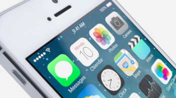
Apple’s use of layers to create depth and establish hierarchy, along with their use of translucency is quite remarkable to see. From the new typography to the new grid system used for every icon, iOS 7 is very appealing, and I found myself sipping the kool-aid — hell, I was guzzling it. So, I downloaded the iOS 7 beta on my wife’s iPhone, and I immediately began to regret it.
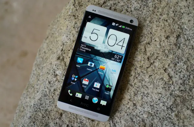
HTC One is just what I need
Buggy beta versions aside (this is just beta 1 of probably 6 or 7 future versions) the change was much different, and dare I say, jarring in person. I feel like I understand the direction they are going, but the execution has not been completely consistent. For instance, the icons are the most common point of interaction with the phone, and many of the newly designed ones are quite jarring with particular renderings — almost unrecognizable from their former versions.
Minimalistic can be good, but their color palette choices and their stark departure from some of the more familiar stock icons just makes me ask — why?! The choice of pastels has me scratching my head — way too much pink and yellow and light green for my taste. Perhaps they will make a light version for the white iPhone, and a dark version for the black iPhone?
One of Apple’s greatest strengths has always been in their installed user base. I can’t help but feel there will be many users unhappy with the update — if the beta looks anything like the final released version. I for one, am very happy to return to my HTC One — for now.

