Design Love: Flib

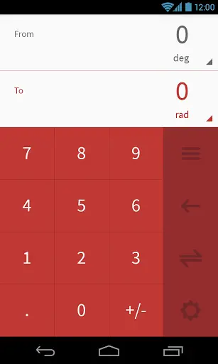
Flib is a converter app that, despite its drop-dead gorgeous look and a 4.7 rating on Google Play, continues to split my opinion. If I were to give an example of a great UI, but imperfect UX, this would be it.

Need to change the units? Just click on the number for whichever needs to be replaced, or the swap button if you need the vice versa. It also keeps track of which category of conversions you perform more, to push them to the top.
My real gripe with the app is that it tries too hard to impress the user. I found the various animations added all over to be a nice touch at first, but I soon found them to be getting in the way. The buttons-flipping-around-into-view animation was overdone, in my opinion, since it was shown with every state change. I got really, really bored of it after a couple of uses, and found the animations to be slowing me down when I just want to get some work done. A decent compromise might be to make them a touch faster, so that you notice them (and the state change) but it doesn’t take up too much time.
Another place where I feel form has been put over function is the screen where you choose what type or category of conversion you want to perform. Since there are more than 12 options provided, the app cannot fit them in one screen. However, instead of simply scrolling down with a flick, you have to press the down arrow on the right. It’s a small thing, but we’re just so used to scrolling with a drag that it seems weird to have skimped on it. Wait, there’s a reason? Oh, yes. To perform that flipping (literally) animation again.
I do know that I am being a bit picky while pointing out the negatives, but that is because this app is so close to perfection. I am certain most users would be more than happy with it, and I cannot state this enough: the developers have done a pretty good job, particularly on ensuring it works well on all form factors and screen orientations. Do give it a try by following this link, and letting us know your opinion.
