Google+ update now live on Google Play – Here’s the old vs new [PICS]
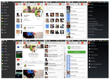
We updated our post a few minutes ago, and as some of you are already discovering, the Google+ update for Android is now finally live in the Google Play Store. I took it upon myself to screen cap some of the key differences between the old version (weighing in at 26.58MB), and the beefed up new version (33.01MB) with Snapseed photo editing built right in.
First off, the sidebar has been given some sing cleaning with Google removing “Local” from the Google+ sidebar, replacing it instead with “Locations.” Pre-update, Local was simply used to forward you to the Maps application for looking up restaurants and businesses, whereas this new Locations option shows you a map view of where all your Google+ friends are located. Think of it as Latitude but for Google+.
User profile pages have been spruced up with a new design and tabbed layout for quickly jumping between About, Posts, and Photos. Selecting Hangouts from the sidebar now forwards you over to the actual Hangouts application (formerly Google Talk). Google+ Messenger messages are now archived, but politely ask you to begin making the transition on over to Hangouts (although users can still reply and initiate messages from Messenger).
Google+ settings are now a lot more streamlined, and look similar to the standard Android settings application, complete with icons as a visual cue as to what’s inside. Oh, and in case you missed it, “Instant Upload” is now referred to as “Auto Backup” in the new Google+ settings, and by default auto-enhance and auto-awesome are enabled if you have your pics set to auto-upload from your device.
Photos are what seem to be getting the most amount of love (and boy, did they need it). Now Google+ offers a much better grid view of your photos, allowing users to view by Highlights, Photos, Albums, or Photos of You. Selecting an image and pressing the menu button now shows a new list of options, the most important being “download image” no longer available (possibly buried somewhere). Of course, the biggest attraction is the new Snapseed intagration which can be opened by selecting the little pencil icon. From there, users can choose from a list of standard hipster-filters, or tweak the image in other ways. After editing, Google+ reminds you that the original images — before the changes — is still saved and can be restored at any time. Nice.
And that’s just gonna about wrap it up for the changes to the Google+ application for Android. Curious to hear your guys’ thoughts on all the changes. Is it for the better? Or is Google+ a confusing labyrinth of submenus and options? If you haven’t yet, you can download the update for yourself via the Play Store link below.
[The new Google+ on Google Play]