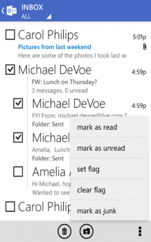
Outlook.com app finally doesn’t look like complete crap

I stress “less ugly” because Microsoft tried to combine its Windows Phone-esque interface with Holo elements, creating a mashup of worlds that just doesn’t feel quite right. I’m probably being a bit too harsh — I’d use it as is — but it would be a lot better if Microsoft could make its mind up about what it wants its Android apps to be.
For comparison’s sake, the Xbox SmartGlass app and Bing don’t do anything to incorporate Holo, instead opting for user interfaces that feel a bit out of place on Android. Microsoft probably feels like the Outlook.com client’s hybrid nature is a good compromise, but it only makes me mad to see what the app could be if Microsoft would stop being stubborn and decide to go full-on Holo.
I wouldn’t bank on that happening, though, as the company likely wants to maintain a degree of uniformity no matter which platform its apps are on. That said, anything is better than the old app so you might as well download it in the Google Play Store and be happy that Microsoft has finally gotten around to bringing the Outlook.com app into the 21st century.
[via Microsoft]
