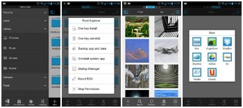
ES File Explorer 3 now available in “Public Test” version via Google Play
While I wouldn’t go as far as saying ES File Explorer is one of the ugliest file managers around… let’s just say it was never going to win any beauty pageants. Good news, the developer is looking to change that in the latest version dubbed ES File Explorer 3. While not officially ready to make its grand debut, the app is available to play with and try out in “Public Test” form before it goes live on April 20th. You can see from the screenshots that it’s been given a complete UI overhaul. No more funky looking icons and visuals from 2002. Besides handsome good looks, here are some additional changes:
What’s new
- New UI
- Support Multiple Windows
- Send Files To Others By WiFi
- Support Gestures(Drag, Zoom, Slide)
- Fast Access
- New Pictures, App Managers, Root Explorer…
- Classic Theme
- New Notification and Progress
Looks like there’s a lot of new features and additions. Google Play link provided below.
[ES File Explorer 3 Public Test on Google Play]

