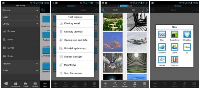
While I wouldn’t go as far as saying ES File Explorer is one of the ugliest file managers around… let’s just say it was never going to win any beauty pageants. Good news, the developer is looking to change that in the latest version dubbed ES File Explorer 3. While not officially ready to make its grand debut, the app is available to play with and try out in “Public Test” form before it goes live on April 20th. You can see from the screenshots that it’s been given a complete UI overhaul. No more funky looking icons and visuals from 2002. Besides handsome good looks, here are some additional changes:
What’s new
- New UI
- Support Multiple Windows
- Send Files To Others By WiFi
- Support Gestures(Drag, Zoom, Slide)
- Fast Access
- New Pictures, App Managers, Root Explorer…
- Classic Theme
- New Notification and Progress
Looks like there’s a lot of new features and additions. Google Play link provided below.
[ES File Explorer 3 Public Test on Google Play]


Maybe not the best looking, but I have tried other ones and always come back to ES. I guess partly because I’m used to it, plus it works for what it is designed for. I’d love a facelift though :-) bring it on
Same here. Other than appearance, it’s exactly what a file manager / root explorer should be.
I’ve been using the beta version for months and have loved the new design and everything has been working wonderfully.
The best part of ES is that it let you map windows network drives and copy any file from and to the phone without cables. Its faster than usb…
And supports tons of cloud services!!! it’s like having those cloud services directly on your smarthphone…
Big fan of the SMB sharing. It’s the reason I’ve used ES since I had my G1.
This new look is definitely pleasing and I’ll be using this app again :-) Astro was good but the constant updates without a change log really bugged me.
Love ES; Root level access, FTP support, LAN support, etc. etc. Great app.
my fav file explorer too. will try the new one.