Google Play Store 4.0: What’s New? [VIDEO]
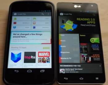
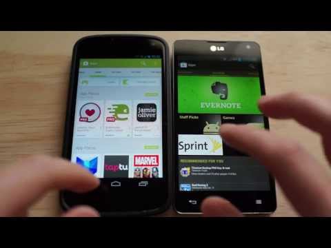
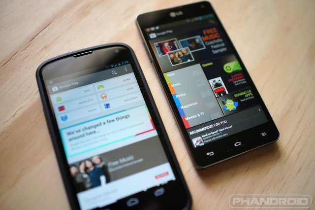
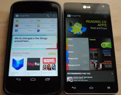
By now many of you have grabbed the APK for the new Google Play Store and given it a whirl for yourself. If you haven’t gotten it yet for one reason or another, though, then look no further for a comparison of the old version of the Play Store compared to this brand new redesign. Chris Chavez dove deep into the juicy bits on camera, giving you a side-by-side look at everything there is to see.
Aside from a tweaked color scheme, a new card-style layout and new interest-based categories, there’s also a tweaked purchasing flow and other minor tweaks. We won’t spoil all the fun, though, so give it a download for yourself or check out that video above if you haven’t got the time (or another good reason why you can’t install the APK).


