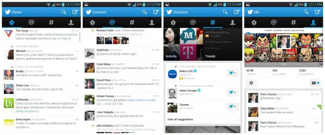
Twitter for Android update brings Holo UI, swipeable columns, and more (old vs new comparison)
It’s been a long time coming, but it seems the developers at Twitter have finally caught onto the craze that’s sweeping the nation: Holo. Sometimes known as HOLOYOLO, Holo is a term used to describe Matias Duarte’s new look for the Android UI that was introduced back in Honeycomb. It’s a more minimal, “flat” UI styling that as of today, has finally made its way over to the official Twitter app. You can take a look at the before (below) and after (above).
Old Twitter. Ew, yuck!
But that’s not all, probably the most useful update to the UI are the new swipeable columns. This alone has kept me from using the official Twitter app for more than 2 seconds and comes as a needed, most welcomed change. It’s also easier to see your full follow list by simply typing “@” when composing or searching a tweet. Before, you’d have to type at least 1 letter after the “@” if you wanted to pull up a list of suggestions. Not helpful if you follow tweeters that constantly change their name (or if you can’t simply remember what their handle is). Oh, and the same now applies to hashtags as well. Lastly, links to the Play Store no longer direct you to your browser, and then to the Play Store — it’s all direct now. If you want to give the new Twitter a spin for yourself, the app can be download via the Play Store link below.
[Google Play link: Twitter]
