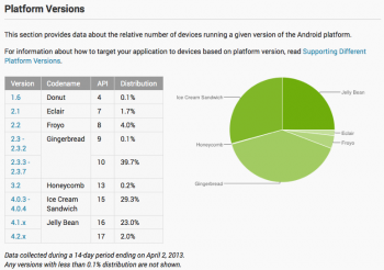
Jelly Bean jumps from 16.5% to 25% after Google changes the data in their platform version chart
You know the Android platform distribution chart we take a look at the beginning of every month? Yeah, the one that tells us (and developers) the total percentage of Android firmwares running on Android devices around the world? We watched it like hawks, analyzing the data, rejoicing as Gingerbread finally began to decline as Ice Cream Sandwich raised. Well, you can forget about everything you used to know because tonight Google has announced that they’ve changed things up a bit.
Apparently, the old method of displaying their data wasn’t doing anybody a lick of good (and wasn’t exactly helping their PR either), so they’ve completely scrapped the old way of showing data from the famous pie chart. Now the chart will only show the percentage of firmwares running on active devices — those that have recently opened the Google Play Store — not just those that have pinged Google’s servers a year ago. Here’s what they said via the Android Developers site:
“Beginning in April, 2013, these charts are now built using data collected from each device when the user visits the Google Play Store. Previously, the data was collected when the device simply checked-in to Google servers. We believe the new data more accurately reflects those users who are most engaged in the Android and Google Play ecosystem.”
Honestly, this new method makes a lot of sense. In case you were unaware, this information was to serve one purpose and one purpose only: supply Android developers with the info they needed so that they wouldn’t waste their time, money, and effort on supporting a game or application for an Android firmware nobody was running. Now, developers are being shown only those users who are active on Google Play, the place where they’ll be listing their applications for download. Another tool for developers is a new chart displaying the percentage of Android devices equipped with a specific display resolution.
So, does this new way of displaying data happen to skew some of these numbers in Google’s favor? You betcha. Last month we saw Jelly Bean running on only 16.5% of total Android devices in the world. Of course, there were floods of headlines blasting Android’s “fragmentation” problem. Today, that Jelly Bean percentage has jumped all the way up to 25%. That’s nearing Ice Cream Sandwich territory, folks. I guess iFans are going to have a tougher time touting their software superiority now that the data has changed. What do you guys think? Does this new chart make more sense, or did you prefer Google’s old way of displaying data?