[Update] Is this screenshot of Google Babble legit? You decide
[Update]: It looks like this is another fake, folks. (Not that we expected anything more.) The icon used is the same one that Google+ user Shen Ye created on his own. Alongside that, reader Alankrut Patel pointed out how some elements of this image prove this is likely just a mock-up thrown together by someone who was simply bored. In other words, there’s nothing to see here (but keep discussing what type of design you’d like to see for Google Babble, anyway).
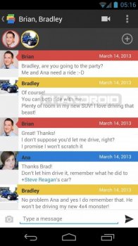
Last week’s Google Babble leak might not have been that believable — after all, a cheesy poll screen and some bad grammar didn’t do well to convince us — but we’re holding out hope that we’re inching close to final form for a version 1.0 release. An anonymous tipster sent us another supposed shot of Google Babble today, this one being much cleaner and “Google-like” than what we saw last week.
This particular screenshot shows a simplified Holo-styled user interface that incorporates elements from a couple of different Google services. For starters, the member list near the top uses pictures that are surrounded by different-colored circles ala Google+. The colors on those circles are all used to identify a new string of messages from each individual in the chat.

The rest is straight forward, classic Holo — the “back” arrow on the app’s icon in the upper-left corner, the overflow menu and video chat icons on the upper-right, and the standard list and text input elements below all of that seem quite believable and realistic.
Its simple design would fit with Google’s style, but it’s also simple to a fault. With other elements — such as picture messages or other views within the app — it might be easier to call this out as a fake as those are tough to get down, but whoever made this didn’t give us much to scrutinize and didn’t get imaginative enough to the point where they might have messed up.
It also doesn’t have that new, distinct style we’ve seen in a couple of newer Android applications. Google Keep launched with an evolved Holo style that was akin to Google Now’s card-style layout, and we’re told to expect the same thing from a major upcoming Play Store upgrade sometime soon. That particular style might not be required for all of Google’s new or updated applications going forward, but it’s something you have to think about.

What do you think? Is this just another fake or will a group chat inside Google Babble end up looking something like what you see above? Hit the comments section below to give your input, and don’t forget to throw in suggestions about what you’d improve while you’re at it.
[polldaddy poll=6989572]
[thanks anon!]