The greatest part about Android is the sheer flexibility developers have with the platform. Sometimes we see a rival OS come out with some pretty interesting ideas and features and as Android users, we don’t have to mope around wondering when Google will introduce something similar to their mobile OS. No. A random developer from the Play Store can create an app with much of the same functionality.
Take the Ubuntu Touch OS which, back when it was introduced, showed off a slick way of jumping to your favorite apps using a sidebar gesture. Have to say, I was a bit envious. Well, I wasn’t green for too long as developer Mohammad Adib has created an app called Sidebar (Lite and Pro) that mimics Ubuntu’s multitasking behavior, granted it doesn’t always work perfectly. Let’s dive into it.
What I Liked
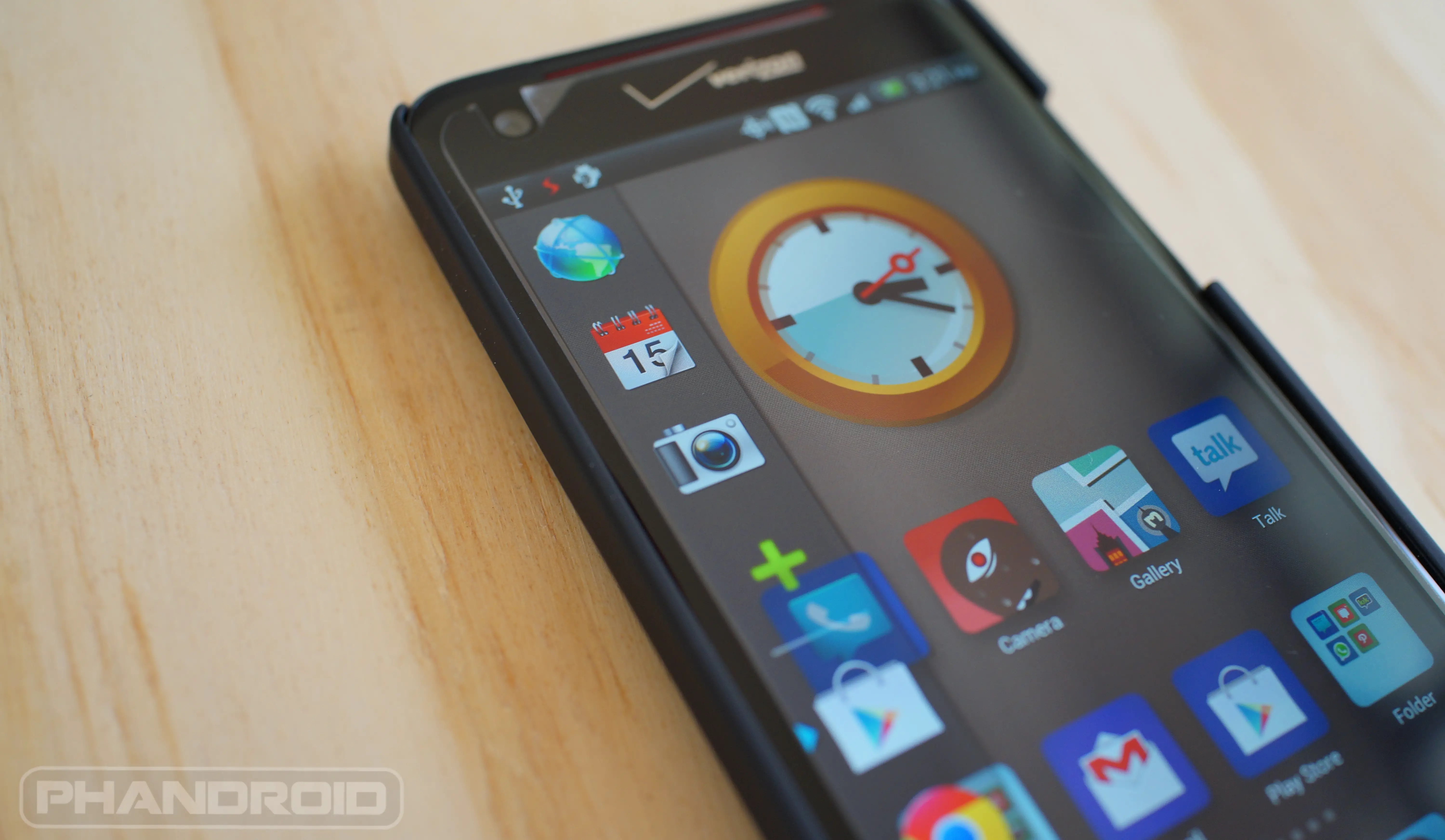
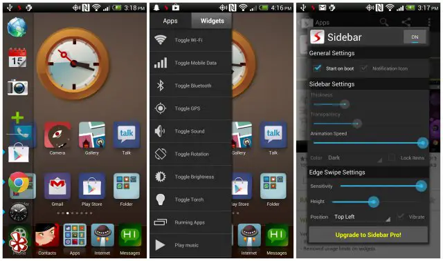
Alright, so Sidebar behaves much of the time exactly how you’d expect it to behave. Pulling from the side of your screen (this can be configured to either the left or right side) pulls up a list of apps and widgets that can be customized with the app shortcut of your choosing. In the latest update, the developer has added the ability to list your recently used applications, making it loads more useful for quickly switching applications (especially since I loath using Sense 4’s multitasking menu). And it’s not just applications. You can even add shortcuts to toggle WiFi, Bluetooth, Torch, even music player functions like play, pause and skip. Configuring Sidebar to your specific tastes is also easy an intuitive (see above screenshot). There’s a variety of toggles to adjust the sensitivity or how big the icons appear in Sidebar. If you have a favorite theme you’re using and want Sidebar to match, you can even change it’s color and opacity. All in all, this sounds pretty epic, right? Well, now let’s talk about what I didn’t like.
What I Didn’t Like
Customizing Sidebar with your favorite apps or quick toggle shortcuts is a chore. Adding and deleting is simple enough, but once they’re in your Sidebar, it’s impossible to arrange them without first deleting one and adding another to the bottom of the list. This could be easily fixed (in theory anyway), but enabling some kind of drag and drop interface that I’m praying will come in a future update.
Another issue I had with the app was its speed. You would think tapping the icon of an app recently opened and still waiting in RAM would pull it up instantly — this was not the case. There was often times a 2, even 3 second lag time waiting for a summoned app to open. In that downtime alone I could either use the horrible Sense 4 multitasking system, or jump to my homescreen and select a shortcut from a folder.
Lastly, Sidebar doesn’t play well with other apps. If you have an app that needs to run in the foreground, Sidebar will push it somewhere in the back, knocking it on the floor and giving it a few quick kicks while it’s down. When playing Rdio for instance, I couldn’t get through a single song without the app closing on me. Other times, I’d unlock my phone only to be greeted with a blank or transparent screen where the only thing I could select was my notification bar. Almost as if an invisible app was open, just not behaving properly. It wasn’t until I uninstalled Sidebar that my phone once again started behaving itself, and I regained my sanity.
Verdict
The idea of Sidebar is what I love and I think it has the potential to become great. A few updates from now, after all the bugs have been ironed out and everything is working the way it should, I’ll revisit Sidebar. Until then, there’s no way I can keep this admittedly brilliant idea installed on my phone. If you guys want to give it a try for yourselves, the free “Lite” and paid $2 “Pro” versions can be found below. Maybe you’ll have better luck than I did. Or perhaps you prefer another multitasking application? Let me know if you’re using another app with similar functionality in the comments below.
[Google Play Links: Sidebar Lite and Sidebar Pro]






Unity Launcher is better when talking about performance, but lacks some eye candy compared to Sidebar.
Okay, just gave Unity Launcher a spin. It definitely pulls up apps a LOT quicker…. but it’s kind of an eyesore (free version). Gonna download the paid version and see if I can pretty it up a bit.
Edit: Can’t use Unity either. It’s on a timer so you have to set how long you want it to be visible. On Sidebar, you touch anywhere outside the Sidebar and it will disappear. Arrrgh…
Edit: Just gave Glovebox a try and it’s damn near perfect. Might have to give this a full review.
Yes, I am using Glovebox too. With other side launchers you have to swipe, wait a teensy bit for the bar to appear, THEN select what you want. With Glovebox, the bar follows your finger, and you can launch apps without lifting it. The only thing it is missing IMHO is a support for folders or grouping, since it doesn’t seem to be able to scroll . Also an ‘all apps’ shortcut on top would be useful which would pull up the app drawer from the launcher.
I don’t get the appeal. I had this on my samsung omnia like 5 years ago…
Lawl
Chris, I’ve been meaning to say I was slowly phasing phandroid out of my sites before you joined as it didn’t seem to be updated very often and there was a big lack of content altogether. I know the turn around isn’t entirely you but you are a big part of it and I visit phandroid like a bazillion times a day now
Dude… that’s awesome. Sometimes I feel like I haven’t made much of an impact on this site as my writing talents are severely limited (as I’m sure you’ve noticed). I think your comment honestly just made my day.
But yeah, it’s definitely not all me. The rest of the guys have been busting their ass to get up as much content as possible. If there’s anything else you think we could do or feature more of on the site, drop me a line at [email protected] :)
I definitely feel the same way. I phased Phandroid out almost entirely, and then your Android Overload started popping up in my Youtube feed while I was getting my daily Lockergnome and Pocketnow fixes, and it’s my favorite news-aggregated-information-roundup-thang. <3
OMG..is this some man-love i see happening here?? Teehee..
You want in on this too? Tell me you love my body O_o
You are seriously one of the funniest people ever. My goodness. Your random comments in general and in your posts are awesome, and I loved the silly things you did/said in the video above!
Also; I..love..your..body? O.O
This just got real weird, real quick. >_<
The last part was a joke! I swear! ):
So many ‘Chris’s loving Chris…….. hmmmmm coincidence or catfish?
Cawl
I had the same phone, actually still have two of them. It was really sluggish though. Trying to get it to scroll sometimes was the suck. I stuck to using the stock windows UI. The widgets were too unresponsive, which was a shame because it actually wasn’t a bad phone.
Reminds me of Dock from cydia for ios, kool!
Give Swapps! a try. It’s similar in it’s functionality but doesn’t offer as much customization and isn’t as “pretty” as Sidebar. That being said, I’ve been using Swapps! for a couple of weeks and it is much preferred to the stock multitasking option, or even the Nova action, on my S3.
Thanks! Downloading now…
Chris, give SwipePad a shot.
SwipePad shows a grid of 12 apps which you can customize. You can add your most frequently used apps in that grid. Set the bottom edge as the active edge as from my experience, the bottom edge works much better than left/right edges. Just swipe up from the bottom, move ur finger over to the app you want to switch to and release. As simple as that, this has to be the quickest way to switch between apps.
Also, if you have Nova launcher installed, using Nova Launcher’s Activities, you can create a shortcut directly to application menu items, such as Create New Note in Evernote (com.evernote.note.composer.NewNoteAloneActivity) and place this shortcut in the SwipePad grid. That way, when you need to note something down instantly, you can swipe on your screen and choose this shortcut, which directly opens a new note on Evernote.
Of course, the downside remains that you can only set 12 apps which will be a deal breaker for some people. For me, 12 is a decent number, as for the apps i dont use that often, i dont mind going to my home screen and clicking on the shortcut.
SwypePad is the original, and a very quality launcher. But it’s a different breed, really; these are about quick access, and as much as I enjoyed SwypePad, using Nova Gestures in combination with GloveBox and an expandable dock really made SwypePad feel archaic.
Glovebox actually works better but doesn’t have as many options
Glovebox is pretty epic. Might have to feature this in my next review. Good lookin’ out.
: )
looks nice but it’s to slow and starts apps over like you said.
Definitely try out Glovebox, if you were digging the Ubuntu interface, it’s much more in line with that, and doesn’t have any lag as far as I’ve found. Less customizability. I gave up Swypepad for Glovebox.
It’s pretty amazing. Best one I’ve tried so far! :D
The first one I got was actually a direct port I found on some backwater blog called Ubuntu User Interface. Glovebox definitely worked better. :P
Nice! Haha!
Full, big, and thick IS just the way you like it huh? Lmao
.-.
I haven’t noticed any of the negatives you mentioned. About arranging the icons: Yes you need to delete them first. But you don’t necessarily have to add the new app to the bottom. You can long press on any of the existing icons and insert a new app above that. I have also not experienced any sluggishness or screen sensitivity issues. Not sure about Rdio, but I haven’t noticed any issues you mentioned when I use Pocket Casts and Google Music. I am using PA with motley kernel on Nexus 4.
I’m sure it’s a Sense 4 thing and their aggressive RAM management :/
Try Pie Control. It’s my favourite.
What theme are you using?
MiHome Launcher. And can’t pronounce the theme (since I think it’s in Chinese) but it’s one of their featured ones. :p
Thanks
I just installed sidepanel, and giving it a whirl, it’s in beta right now. it seems responsive, but I like the transparency feature of sidebar. They work the same apparently, but sidebar seems to have more options. Hopefully, this feature will be built into sidepanel.
Im using pie control for the same funcionality but diferent desing.. also less icon to put onjust two rows of five, although you can asing two action to each icon. its quite nice and works perfectly
Hey Chris, I’m interested in your launcher and what icon set/theme that is. Currently, I’m using Nova and while it’s nice, I’m always interested in trying out many, many things. Please let me know! :D
Also, I’ve been using the paid version of Glovebox since it was available. The only problem I have with it, is that it just doesn’t have that good of a look to it, and it’s taking them a while to incorporate icon themes. It annoys me to see my icon theme in Nova and then stock icons in the sidebar. :p
I’m a huge fan of SwipePad by Calcium Ion and have been using it on all the devices I’ve owned over the last few years. I’ve had no issues to speak of. —> https://play.google.com/store/apps/details?id=mobi.conduction.swipepad.android
Hey chris not sure if you notice but you can long-press on the icons in sidebar and a menu with insert, edit, and delete will popup.