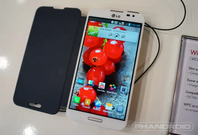
After weeks of teasing and an official announcement made officially official last Monday, the LG Optimus G Pro has finally landed into our hands and we’re here to give you guys a brief hands-on here at Mobile World Congress 2013. Overall the device felt solid and we’d be lying if we said we didn’t notice design cues from that other 5.5-inch phablet.
With full 1080p HD display, 2GB of RAM, 32GB internal storage, 13MP shooter, and 3,140mAh battery — there’s still a lot here to give Samsung a run for their money. LG was able to pack one of Qualcomm’s newer quad-core Snapdragon S4 600 processors clocked at 1.7GHz. This, along with the fluidity of Android Jelly Bean, makes for a buttery smooth user experience and speed unrivaled.
With LG’s Optimus 3.0 UX, they’ve managed to add a few enhancements to your typical ‘Droid device, namely their QSlide apps that appear as floating widgets atop any app currently opened. Overall the device felt snappy and responsive, and if one thing LG nailed it’s the software on their handsets mixing a nicely minimal, Holo-ish UI that doesn’t weigh down Android in the slightest. Quite the contrary, even.
While we wait for an official announcement regarding carrier availability in the US (expected by 2nd quarter of this year), check out our hands-on video where we take a look at the Optimus G with optional “Quick Cover” accessory and let us know if this could be real contender for 2013.




That looks suspiciously like a Touchstone…
Is that Qi Charging?
Tis, tis.
Hey Chris where’s the speaker placed at?
Looks like the Galaxy S3… why not try to be original?
Love it. Great camera. What kind of storage does it come with? What about sd card support? Thanks Chriss
I don’t know how much onboard storage it comes with, but there is SD support as well as a removable battery.
32GB of internal storage, with SD expandability up to 64GB.
That is one hell of a package. I will take the one I seen you put in your pocket. Don’t worry I won’t say anything. Thanks, you’re the man.
I’ve been in the cell phone business for almost 6 years now, and when LG first came on the scene with Android smartphones their UI was almost an exact rip off of touchwiz. I’m not a fan of touchwiz, but LG is basically that little kid who tries to dress and act like you to be cool. Their phone design and software are extremely similar to Samsung.
LG’s UI is clearly different than Touchwiz.
Here is your example of the beginning.
http://cdn.ausdroid.net/wp-content/uploads/2011/01/galaxys-optimus2x.jpg
How is that relevant now?
This phone is a beast. It probably doesn’t feel cheap like them Samsung phones.
” ‘Droid?” Ugh. Don’t we have enough issues battling the general public perception that Verizon’s perception bad created without having to deal with it here too?
LG definitely has the best skin on android. Although I still prefer stock, there are a few feature I hope to see on future stock releases.
Still pissed that they went with a home button
I dislike the LG UI. it looks too wannabe-Samsungy.
really? Could they try any harder to copy samsung’s design? Right down to the flip cover case. Jesus.
I know, it only has a few things better than Samsung and overall I think the Note 2 still tops it. The different app pops ups other than just browser with the transparent slider is nice, and the 1080p is nice for devices over 5″. The Note 2 is amazing though, and the multi window beats the pop ups in my opinion. I’d love to see more types of pop ups with options in the Note 3, a 1080p screen, and the IR sensor so I can control my Samsung smart tv.
The worst of it is, LG makes some solid hardware. Im sure if they actually tried to design some unique looking stuff they could be very successful
honestly, we need to forget about the copying thing.
I am waiting on Motorola to announce the X phone to see what they have to offer or else, this will be my next phone assuming Verizon offers it.
Looks like a Galaxy Note 2. No S-Pen stylus though.
Phone looks awesome can’t wait to try this out.
NO S-PEN! NO BUY!
thats fuckin nice, looks crazy fast
On the LG I like the pop up apps with the transparent slider, but I don’t think I like it better than the Samsung Note multi window feature. Maybe the Note 3 will have more pop up options to compliment the multi window.