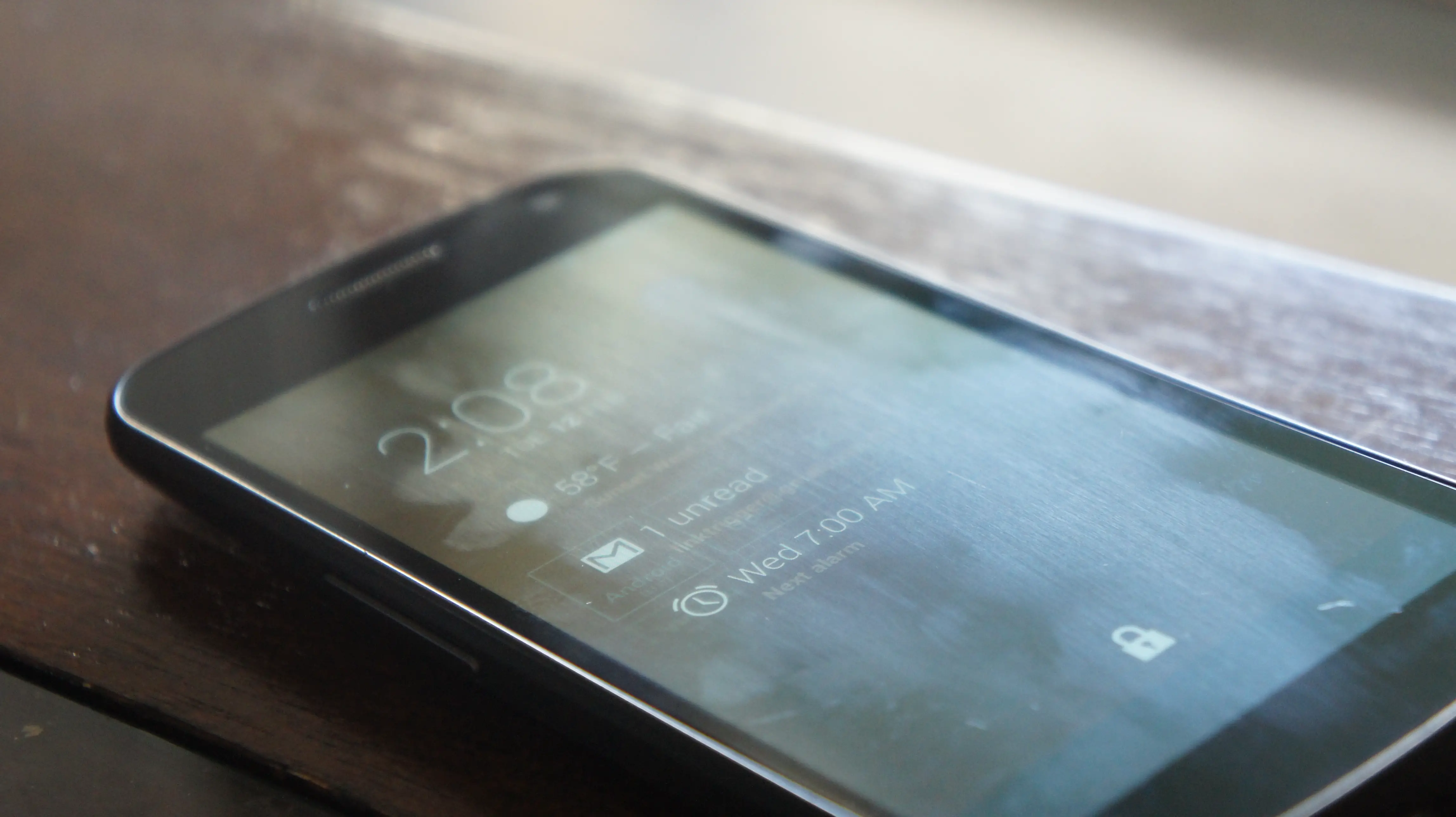
Hot off the Google Play Store comes DashClock Widget. It aims to be your central clock widget for your Android 4.2 lock screen. DashClock allows you to see your current weather, unread emails and text messages, and much more. The best part? It’s open sourced, meaning that anyone can take the widget and make mods and themes for it.
We really appreciate the simplicity and beauty of DashClock Widget. It’s no surprise that it follows Google’s design practices since it was created by a Google engineer, Roman Nurik. DashClock Widget uses “extensions” to show you the information you care about. At launch, you can choose to view your current weather, unread emails and text messages, your next appointment, next alarm, and missed calls. The real beauty lies in keeping this widget open sourced.
Developers and modders can tap into the app’s code and APIs here, allowing them to make custom extensions and customize the widget any way they see fit. As far as customization goes, DashClock is pretty limited. You can’t change the transparency or colors of the widget, but that should all change once developers get their hands on it. You can check out the app in action in our hands on video above, and give the free app a shot in the Google Play Store if you’re on Android 4.2 or higher.






Looks great, but BeautifulWidgets had me at hello^W $0.99 :)
(btw, a playstore search for “dash clock” doesn’t return this app; have to remove the space)
BW is great, but I love FancyWidgets simplistic weather screen. The actual widget skins themselves look better on BW though.
I’ve just switched from FW after 18 months back to BW [the update did it for me] also the fact that FW 4×2 now looks ridiculous on my new bigger screen where on BW it auto expands to fit the larger screen size. I bought both of these when I first got the Galaxy S.
Some of these lock screens seem to defeat the purpose… maybe I don’t want ppl to see the first couple lines of my texts and emails. Hence why I have a lock screen
True, but if you have a password, this app will not show the details of your message, and if you don’t use a password, you still have to swipe down to see the info.
But others like that functionality. It’s a good thing we have choice ;D
CHOICE?!? What do you think this is?
I don’t understand your reply, don’t you agree with him?
The choice he was talking about is not to like it or not, but to use it or not.
People who criticize lockscreen widgets sound like they give reasons why it shouldn’t be, like they’re not aware that it’s optional.
What part of Chris’s sarcasm did you not get?
I still don’t understand (perhaps because English isn’t my mother tongue).
What does it mean?
What does “this” refer to in his comment?
Translation: CHOICE?!?! Well, of course you have a choice! “This” is Android!!!
I don’t know…
That’s basically what Anthony said, so if you’re right I don’t see the point of this reply.
Mr Chavez is the only one who could clarify it, but he’s apparently above that.
Thank you for trying.
To me, the primary purpose of a lock screen is not to preserve privacy, it’s to prevent accidental actions caused by involuntary screen touches.
The best way to preserve privacy: never leave your phone lying around when you’re with people you don’t trust.
Solid advice, i’d also like to add: never look at porn while on the train, all pornographic viewing needs to be done at home.
Sooooooo dont use it.
That’s because its called dashclock.
Congrats on your first article!
Ok, so… it’s just like CM’s chronus widget, only easier to find as a standalone package on the android market play store?
it’s not just like that widget because that widget doesn’t exist.
Maybe there can be an Accessibility service extension then the widget can get all the notifications?
I would like to point out the major problem with the variety of clock widgets, and even worse, the customizability.
Someone might create a clock that violates Steve Jobs’ sense of good style.
Therefore there should be one and only one clock widget.
Looks awesome. Of course I can only use on my Nexus 7 since $#*@! Verizon won’t upgrade my GNex to 4.2.
Just wish it would allow to remove the clock. The clock takes up all space on the lock screen widget. So when the phone is switched on locked, all you see is the time (twice).
I never understood the desire for a clock widget. There is a clock already on the screen all the time. I like the other extensions, but I guess I’ll stick with Executive Assistant. Just wish it would finally adopt a more Holo look and feel