Probably the best part about Android is its sheer variety of homescreen replacements (or launchers) available in the Google Play Store. Of course, sifting through all of them provides a challenge in itself and most of the time, most are simply rehashes of the stock AOSP browser with a few added features. Every now and then, a developer attempts to change things up by coming up with a launcher that’s truly unique, changing the behavior and look of the traditional launchers we’ve grown accustomed to.
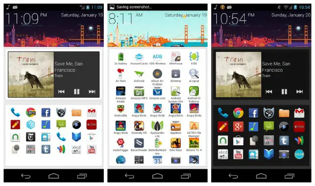
One such launcher is SF Launcher by Alamo Apps and it offers a fun new take on a traditional launcher setup. Still very much in its infant stages, the homescreen replacement looks to mimic the UI and stylings of the Google Now app found on Jelly Bean devices.
The first thing you’ll notice upon downloading is a big, colorful header with the time and date similar to the one found on Google Now, only minus the search bar (we really need an option for a search bar). Currently, the header can be customized to show a cartoonish landscape of either San Francisco (that’s where the SF in SF Launcher comes from), London, or a generic mountainous region.
Below the header are 2 sections: a spot for widgets (that can be scrolled horizontally), and the other to place your favorite app icons. Swipe to the right, and you’ll find all your applications neatly tucked away in alphabetic order. Give ’em a long press and you can send them over to your favorites section.
Swipe to the left and you’ll find a few settings for tweaking your homescreen to your liking. This can be done a variety of ways. There are settings to change the theme between light and dark, and even have it change automatically according to the time of day. Pretty snazzy if white backgrounds give your battery anxiety. Other settings include the ability to change the size of the icons, columns, as well as display their names and adjust font size.
That’s pretty much all there is to SF Launcher. Clean. Simple. Minimal. Oh, and don’t forget — still very alpha. Sure, this wont be for everyone (what app ever is?), but with regular updates coming almost daily, this might be one launcher you want to keep an eye on. You can download SF Launcher Alpha for free in the Play Store.






San Francisco ftw! World Series and now the Super Bowl? Who got it better than us? Yeppp! In other news, this launcher looks neat.
I though you lived in South Carolina or something? O_o
Whaa? You’re joking, right? I lived in SF then moved to Portland for “work.” We had this discussion over tea and crumpets I thought? :(
Ouch the relationship is crushed. LOL
Ohhhhhh.. that’s what it was. I got confused cuz of your southern twang. xD
SC, SF, same difference huh? :-P
I live in South Carolina. Do we have a problem? Care to step outside? :P
Whatever happened to ROU Launcher? That was supposed to be the NEXT BIG THING but never came to fruition.
Interesting concept for sure. Still a tad on the not so attractive side. Still, one to watch.
Great concept .. realize its still early but kinda boring. If you like a minimal launcher, 3 screens, minimal widget use this might be your thing.
This looks very interesting, i’ve downloaded the app but I’ll wait till they make more updates.
I’m the developer. With regards to scrolling, the current issues are because I have to use the ViewFlow third-party library instead of the common ViewPager class from the support library because it uses fragments, which, for some reason can’t host app widgets.
I’m working on drag and drop, but so far, it’s proving to be one of the more difficult updates.
As for the limited selection of cities, it seems that Google Now no longer provides illustrated headers for any cities other than SF, London, and the generic mountains.
Thanks for the post!
Chris,
alphabetized favorites could actually be MORE annoying if you think about it: If you ever change your favorites, then the order shifts and you lose the muscle memory of knowning where your most used apps are.