15 Minute Challenge: $16 Next Launcher from the GO Launcher Dev Team [VIDEO]
A wise man once said, “You can never have too many options.” Or maybe that was just me. Anyway, that’s the beauty of the Android OS. When it comes to customizing, there are almost countless methods at an Android user’s disposal, making for devices where no 2 are ever the same. One of the easiest ways to change things up is simply to swap out your stock launcher (you know, your homescreen where you dump all your app icons) for another. Instead of releasing another of the same old traditional Android launcher you’ve come to expect, the boys at the GO Launcher Dev Team are it again. This time they’ve released a re-imagined launcher into the Google Play Store called Next Launcher.
First things first — let’s talk about that price. Next Launcher is one of a very elite group of “premium” launchers to launch in the Play Store at the $16 mark. While I’m all for paying good money for great software, you really gotta bring something new to the table to warrant box-o-Ferrero-Rocher-pricing. The GO Team attempts to accomplish this by injecting an incredible amount of flare and pizzazz into Next Launcher. But does it really make for anything new or intuitive? Well, yes and no.
Initial Impressions
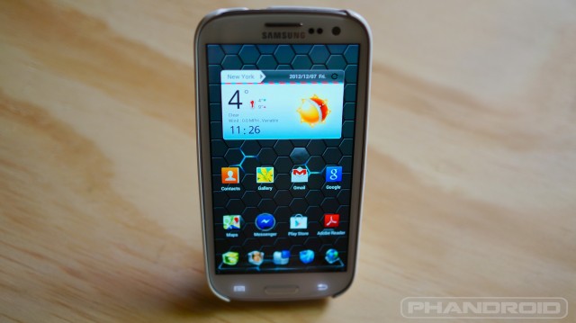
Unlike TSF Shell that threw the traditional Android launcher for a loop, Next Launcher behaves very much in the same way you’d expect a typical launcher to behave. You have your homescreen, app drawer — all of which can be customized with various animations, shortcuts and widgets. Nothing new there. However, you have a bit more freedom in how to display your icons on your homescreen. Using a 2-finger gesture, icons can be rotated 360 degrees, allowing for a fun, and unique layout.
Everything in Next Launcher is fluid and animated beautifully. I haven’t seen a launcher hitting a constant 60fps since TSF Shell. But alas — that’s where the eye candy ends. The stock “theme” on Next Launcher is a sort of mix of glossy, glass looking icons with neon highlights. Yes, neon. This (aside from its ridiculous pricing) will no doubt be the biggest turn off for most Android users. I understand Matias Duarte’s “Holo UI” may not be for everyone, but for heaven’s sakes, the GO Dev Team could have gone with the traditional GO Launcher icon set/theme. Something less Fast and the Furious and more minimal. To call Next Launcher simply “inspired by” SPB Shell 3D Launcher, is an understatement. It’s clear what the Go Team was trying to accomplish here (even in pricing).
Widgets n’ Things
Like GO Launcher, Next Launcher has specific widgets and live wallpapers that will only work 100% on NL. Not yet available, the GO Team did mention that “fancy 3D widgets” will be coming soon, so we’ll have to wait and see how impressive those turn out. The first live wallpaper for NL, Next Honeycomb Live Wallpaper, is truly a sight. While you can get it to display on other (cheaper) launchers, it wont have the same special effects as when displayed through NL.
15 Minute Verdict
Of course, it’s going to take a whole lot more than fancy live wallpapers and snazzy animations to get anyone to plop down $16 on a launcher replacement. In fact, in its current state, I can honestly say there is absolutely nothing offered by Next Launcher that really deserves such a ludicrous price tag. $5? Sure. $7? Maybe. $10? Easy, tiger. $16? STAHP. While I normally love almost anything the GO Team releases in the Play Store (no, not because it’s free), when it comes to Next Launcher, your money could be better spent supporting smaller devs like Tesla Coil’s Nova Launcher.
[Next Launcher on Google Play]


