Android team shows how beautiful Tasker could be with modernized UI [VIDEO]
In case you haven’t noticed, the Android team has been running a series called “Android Design in Action” where they take apps with outdated user interfaces and show how they could look with Android’s much nicer Holo UI-based elements. Well, the latest video in the series highlights an app that I think everyone agrees could use some tender love and care.

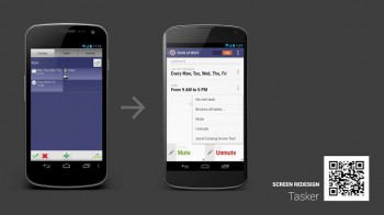
I’m talking about Tasker, the automation app that can manipulate your device in many different ways based on many different factors. For instance, you can have your device turn WiFi off, Bluetooth and GPS on, and dim the screen brightness once you leave the house. As great as this app is functionality wise, it’s no secret that it’s butt ugly in design.
Googlers Nick Butcher, Roman Nurik and Adam Koch get together and re-imagine Tasker as an app that looks like it was designed in 2012 instead of 2008. It makes use of better fonts, image resources, the best Android design practices as outlined in Google’s official style guideline and more to make Tasker look like a the mobile app equivalent of Shakira instead of Whoopi Goldberg.
It’s a long watch as it comes in at just over half an hour, but it’s a great video for us to fantasize about what could be with this great app. Is Tasker’s current user interface going to make us stop using it? No. Substance comes before style in this rare instance because no third party option comes close to the abilities Tasker provides. But I would be a lot more happy to see the result of the Android team’s imagination hit the Google Play Store one of these days. Take a gander above.
