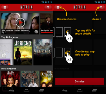
Netflix for Android users seeing new user interface?
Some people are claiming to see new user interfaces in their Netflix for Android applications despite Netflix not having an update in the Google Play Store. That would, of course, be explained by the fact that Netflix likely uses an HTML5 webview for its main content pane, a setup that would allow them to update several UI and functionality elements without having to submit an update to the Google Play Store.
The new interface apparently delivers a side-scrolling experience not unlike what we’ve seen on tablets, the desktop, and other devices. It has a darker look and feel, and new options to single-tap a movie/show card to show info on it or double-tap a card to play are present. Even on a fresh download of Netflix I was presented with the old user interface, but enough users are reporting the changes that this just might be true. Let us know in the comments if things look a litle bit different from you. [Droid-Life, Google Play Store]

