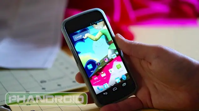
Matias Duarte on Android’s UI: It’s Only About 33% Of Where I Want It To Be
Google’s Matias Duarte is more than just a snappy dresser, he’s also Google’s Senior Director of Android User Experience. Today, the man responsible for taking Android’s design out of the stone-age and into the brave new world of Holo UI, was congratulated on the official Android Google+ page after being recognized as one of Fast Company’s “50 Designers Shaping the Future.”
While most Google+ users were quick to send Matias their praise and congratulatory messages for all his hard work (pre-ICS, Android wasn’t exactly known for its beauty), the thread quickly became overrun by users who jumped on the opportunity to point out Android’s current design flaws. It’s true. Android isn’t totally “there” yet — anyone who spends a lot of time in OS can tell you that. This general feeling was also echoed by Matias who responded to design criticisms saying:
It’s true, we still have a lot of work to do. Personally I feel like I’ve gotten only about a third of the way to where I want to be with regards to consistency, responsiveness, and polish.
Better get back to work!
If you thought things were looking pretty polished already in Android 4.1 Jelly Bean despite uneven icons and general UI inconsistencies — there’s still a lot of work to be done but you can rest assured that Matias Duarte is on it.
[Google+ 1, Google+ 2 | Via BGR]
