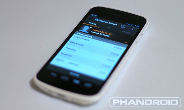
Paypal Updated In Play Store – Brings All New Schnazzy UI
PayPal has introduced a fun little update to their Android application in the Play Store this evening. No, there wasn’t the usual bug fixes, or improved device support. PayPal simply spiffed up the UI of their app, making it more simple and easy to use than ever.
There’s only 3 main options here, folks: account, sending, and receiving. The options are displayed in tabs along the top of the app and while I dig the new look, it was a bit odd that you couldn’t swipe between the 3 tabs. PayPal did mention landscape is coming in a future update, so maybe they’ll throw in some swiping gestures while they’re at it.
