Tagy for Android review
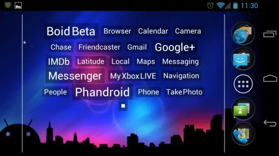
As part of Developer Appreciation Month we recently interviewed Vlad, a developer responsible for an interesting widget called Tagy. Tagy gives you a text-only interface for launching apps and is compatible with any launcher that supports widgets. We’ve been using the app for a few days and are ready to present our review.
A launcher within a launcher
Tagy is a widget, and a widget only, that can be placed on the homescreen of any launcher. The widget is a text-only launcher, of sorts, that allows you to fit more apps on one homescreen than you’d normally be able to. You can add any amount of apps to each widget. I could have a social widget, for instance, and have nothing but social applications inside it.
The widget gives you many options, but the coolest is undoubtedly the ability to allow apps’ names to get bigger as they’re used more. This is not unlike the widgets you might see on various blogs which show you which tags are more popular. At a glance you get a view of which apps you use the most. Conversely, the smaller the text the less you use a certain app.
This convenience feature allows you to launch your most used apps without having to poke around until you find the right one.
Not everything is perfect…
There is just one problem, though: the widget doesn’t change if you launch an app through the apps tray or through a notification.
Since I have a Twitter app that has a persistent notification I use to jump me into the app without having to go to the homescreen, my Tagy widget won’t accurately reflect how much I use that app. I’m hopeful for a future update that’ll change that, but for now it’s something you’ll have to live with.
Another issue I have is with the button that jumps you into settings. It’s a small, square button on the bottom right, and it takes me a few tries to actually hit it.
This may not be an issue for everyone but if your hands are as big as mine you’ll soon find yourself ready to pull your hair out over the inability to press the button on the first try. The saving grace is that you won’t need to jump into settings often.
…But there’s still a lot to like
The settings menu introduces more interesting options. You can turn off the app’s ability to resize text based on frequency, you can adjust tag colors based on click frequency, and you can customize each widget’s color (though this feature is only available in the paid version).
You can choose a background image for the widget, you can choose to have newly installed apps automatically, and you can go in and enable/disable apps to ensure every widget is set up exactly how you want it.
Tagy may not be a killer app for some, but we appreciate interesting, original ideas and there’s no such thing as too many options. I’d use this a ton more if I were someone who had way too many icons on my homescreens, and I suspect people who do are the ones this app was aimed for. Find the free version here, and the paid version here.
Want to get involved in Developer Appreciation Month? Contact us and start your message with “Developer Appreciation Month”.
Don’t miss your chance to win! Sign up for our Developer Newsletter: it’s required to win most of our contests and it’ll feature some huge announcements that you won’t want to miss.
