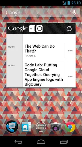
Did We Just Get a Sneak Peek at Jelly Bean In Google I/O Screenshot?
We pretty much know next to nothing regarding the next version of Android 4.1 (tentative version number) Jelly Bean. There’s been murmurings and rumors on what could possibly change in terms of features, but when it comes to a change in the Ice Cream Sandwich UI, we expected little to no change at all. Well, in today’s update for the Google I/O companion app, we may have gotten a little clue on at least one design change in Jelly Bean, starting with the Google search bar.
A slight deviation from the Holo (read: Tron) UI introduced in ICS, the Google search bar is not solid and transparent, while still maintaining a flat, minimal look. Are we looking too much into this? Have we already caught the Google I/O fever? Yes, and yes. If you guys have any idea what we’re looking at, feel free to shout out.

