Android 4.0 Ice Cream Sandwich UX Wins Gold Prize For User Experience Award – Early Holo UI Shown In Video [Update]
There’s no denying that in terms of overall looks, Google hit one out of the park when they introduced a complete UI overhaul that was Ice Cream Sandwich. After countless years (it was only about 3) design was finally a focus and thanks to Matias Duarte ‘n friends, Android 4.0 not only brought a UI worth bragging about — but one that no longer necessitated the need for 3rd party skins to make Android beautiful. The term Google likes to use for this all new UX (user experience) is “Holo,” and apparently it’s up for a 2012 User Experience award tonight, at the Parsons School of Design.
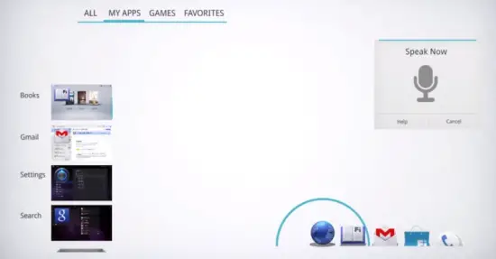
To help celebrate, Google has thrown together a reel of their most famous commercials and somewhere around the 2:00 mark, you can see the initial inspiration for Holo, and where it eventually ended up — on our glorious Galaxy Nexus’s. Of course, we think the Android User Experience Design team should win first place, and we’ll keep you posted with the results. Check out Google’s video below.
Anyone else get tinglies when they saw the animations for the concept Ice Cream Sandwich launcher? Eeeeee… It’s a shame more developers haven’t taken Google’s advice when designing their apps for Android, but keep in mind this isn’t Microsoft (they impose strict Metro UI guidelines for devs when creating apps for their market place). Seeing how there are so few apps designed to Holo standards, a new site has been created to showcase them called HoloEverywhere.com. Feel free to have a look see.
Update: It looks like they won Gold Prize for best platform experience. Way to go, guys! [Google+: Matias Duarte]
Via Droid-Life | AndroidCommunity
