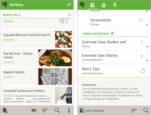
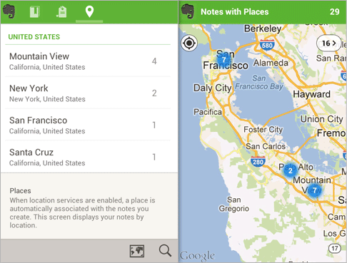
It’s rare you see a cross platform developer implement Android 4.0 design practices into their application but Evernote is showing they’re one of the few that can make it happen. With their latest 4.0 update, they’ve introduced a completely redesigned app that is easily their greatest update — ever.
Everything from their homescreen to their note and notebook lists have been completely redesigned to take advantage of new swipe gestures and more intuitive controls that make finding, and getting to your notes quicker, and easier than ever before. You’ll also notice new Android 4.0 designed “action bars” running along the bottom of the app that are context sensitive based on where you are in the app. When reading a note, the action bar will disappear giving you a full screen to view your note without any distractions. Places is Evernote’s new area for viewing notes according to where they were created. You can even view them on a map, if that tickles your fancy.
Because of their app to desktop (and back again) syncing functionality, Evernote has long been my one and only note taking application on both my desktop and Android device. The best part about it? It’s completely free. You can grab the all new Evernote 4.0 from the Google Play Store right now.


The ui is way cooler… I love Evernote
great update! thumbs up to evernote for keeping up with android guidelines, hopefully more developers follow suit.
Great App
evernote is amazing
Yayyyy!! Oh, wait. None of the three Android devices I have run ICS….