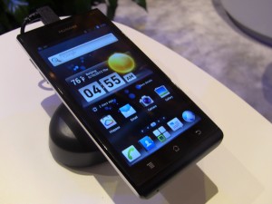
A second look at the Huawei Ascend P1 and Huawei Ascend D Quad [CTIA 2012]
We visited Huawei’s booth in hopes of finding some new Android goods, but we’re sad to say that wasn’t the case. We did decide to play with some older (well, old in terms of being announced) devices — the Huawei Ascend P1 (and, by extension, the P1s) and the Huawei D Quad. The latter, of course, houses a quad-core processor that was developed by Huawei themselves alongside 1GB of RAM, a 4.5 inch HD display and more.
The Ascend P1, on the other hand, is a smaller phone in every sense of the word. It’s one of the thinnest phones coming in at 7.68 inches. These phones were introduced at CES and Mobile World Congress with stock Android 4.0.4, but Huawei’s made some changes to the interface since. For starters, we’ve got a new launcher which doesn’t look too much different than Go Launcher EX’s default theme. We’re fairly positive this isn’t Go, but it’s close.
New icons and widgets grace the device, and a power widget sits in the notification pane, and aside from a few custom apps the rest went untouched. With a custom launcher installed you probably wouldn’t even realize Huawei made any changes. The homescreen gets the custom treatment as well, with two new options for going straight into messaging and phone. It doesn’t hurt the experience at all and actually looks great.
Unfortunately Huawei was unable to confirm whether or not there would be any more changes before these two launch, but early signs seem to indicate they won’t be mucking around too much. Watch hands-on of each device above.