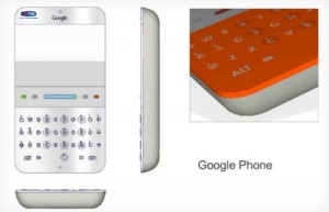
Google’s idea of a Google phone in 2006? Look no further…
Google’s legal battle with Oracle has been oozing with juicy tidbits ever since it kicked off long ago. With court proceedings taking place, things have been a lot more interesting the past two weeks. This time, a render of Google’s original vision for an Android has made its way to the innernyetz.
As you’d expect, the device slightly mimics the portrait-oriented exposed QWERTY devices that were so popular back when this concept was drawn (2006). While we already knew Google was designing Android to be a touch-less device thanks to early versions of the Android SDK’s emulator, this is the first time we’ve ever seen and heard of this concept.
With just two soft-keys, Google assumed touchscreens weren’t need — boy, were they wrong. This was a point in time where Blackberry was first getting noticed by the hipsters and teens, a market that’s proving to be very fruitful in today’s world.
Little did they know the iPhone would change everything. Let’s face it, no one trusted the advent of capacitive touchscreen devices until Apple shook the mobile world up in 2007. Google quietly changed their vision up right around the launch of the device, and the G1 was the result of that new vision just a year later.
64MB of RAM and ROM, a 200MHz processor, a 2 megapixel camera and a QVGA were the highlight specs of this device. In 2007, it might not have been bad. Those were about the same specs that flagship Blackberry devices had. The G1’s specs, on the other hand, more closely resembled the original iPhone’s when it launched in 2008. Are you starting to see the connection?
It’s amazing to see how much changed in such a short amount of time, but Google felt it was for the best and I think I speak for everyone when I say that they made the right choice. Feast your eyes on renders of the concept above and below. [via The Verge]