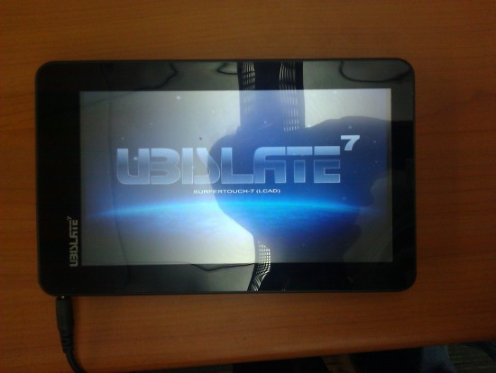
A short review of the $35 Aakash/Ubislate tablet
tl;dr: It’s a waste of money at even $35
When the Indian Government announced the $35 Android tablet, the Aakash, last year, heads turned. And although just about everyone expected it to be pretty bad, there were a few review reviews that said it’s not too shabby (*cough* Gadget Guru *cough*).
I got a chance to play with it today at Startup Weekend Edu in New Delhi, and if there’s anyone on the fence about buying this, I’ve just got one thing to say: DON’T. The tablet offers absolutely nothing. I won’t even use it if I’m paid to do so, and I can’t understand why the Government would waste taxpayer money to subsidize this.
The Aakash is the worst thing that could happen to education. I am a huge believer in the benefits tablets can bring to students, but this is not going to generate any interest in kids in their coursework.
The cons? It’s ridiculously slow, the resistive touch is horrendous (even worse than other resistive touch-screens I’ve used, such as that on the Nokia 5500) and a clunky home screen button, which is the only hardware button other the one for power.
The pros? Nothing at all. The fifteen minutes I got with it felt like a punishment. And considering the delivery delays, I would never suggest giving the sequel a try, either. Even the most outdated syllabus, with a boring text book and an even worse teacher would do more for education than this.
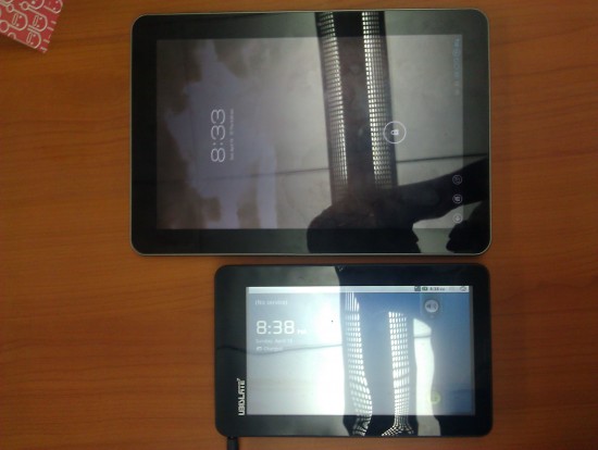
Comparison photos below are with a Samsung Galaxy Tab 10.1


