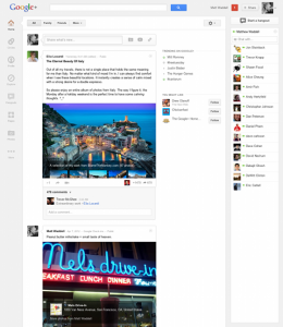
Google+ gets a UI overhaul with focus on simplicity, customization, and community building
A major UI refresh is rolling out for Google+ with almost every aspect of the site getting tweaked to enhance usability and community interaction. While the goal is to create a richer social experience that is more integrated into Google’s core services, the site seems more elegantly simple than ever before.
From the top down we find several major changes, including a customizable navigation bar that is designed to let users choose and arrange the Google+ elements they find most important. “Apps” can be repositioned or moved out of the main bar altogether to keep only desired content just a few clicks away. The navigation ribbon is designed to help users key in their preferences over time and was developed with the future of G+ in mind, making it easy for Google and the users of their social network to integrate new features.
Google has also taken some strides in improving the way content is displayed and interacted with to encourage greater community interaction. Photos and videos are bigger and more beautiful than ever and individual posts have been broken out into “conversation cards” that make it easy to follow and add your voice to ongoing discussions. Furthering this goal is the introduction of a dedicated Hangouts page that will give users quick access to popular ongoing public and On Air hangouts as well as provide a list of hangouts they may be invited to join.
Aside from the main changes and additions, Google has created an Explore page to highlight top content and is continuing to fold Google+ into the rest of their services, making it easier than ever to share interesting web gems or to wax philosophic on the latest trends. Now if only G+’s userbase was as strong as the social network’s concept and design…
[via Google]