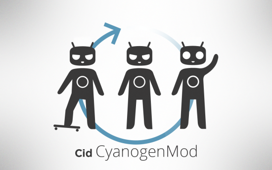
Yesterday, we told you about CyanogenMod’s decision to create a new mascot/logo to reflect the team’s growth as a more mature group of developers working together on a common project. As it turns out, the design from yesterday was scrapped, and they’ve now come up with something a little bit different, a mascot TeamDouche and company are calling “Cid.” The name came out of decision to come up with an acronym for CyanogenMod ID or C.I.D. for short. The CM team elaborated on their blog:
Some of you may also be familiar with the concept of the “id”, the instinctual driving force behind our personalities. It seemed fitting, that this chaotic force and need for immediate gratification, was incorporated into the image of a OS which strives to be on the bleeding edge of Android development.
Love it or hate, I “get” what Steve and team were going for, even if I don’t particularly find the design attractive. Hey, it’s not my ROM. What do you guys think of this new, new mascot? Great? Terrible? Anything you would change?




Garbage!
Nice to see the team is working hard on CM9 :-(
Lol! They didn’t come up with the design, they had someone else make it. Personally, I think CyanogenMod should charge for their ROMs that way they could all quit their day jobs and just dev all day =p
I totally agree! Not too much though.
Worst idea ever. They might as well spit in the face of their fanbase. Charging for it would immediately kill the spirit of the whole project. I’m all for them getting paid, but there needs to be a better way.
I like this one better than the last, but I still miss the original one. I just don’t like how this is too human-form.
Yeah, I’d like it if its limbs were a little smaller and it wasn’t angry. Haha
This!
I’m pretty sure it looks angry cuz you know they got mad skills.
I also would think it’s better if it wasn’t angry looking, lol.
Also the arrow… I get it they tried to imitate the clock hand movement to mean the progressing forward. But in my eyes it looks more like pointing backwards.
I remember Oracle in late 90-ies had to change the angle of how the letteres were cut on the right side, just because of the same reason. The previous cut looked rather like whole logo moving backwards (to the left), not forwards like it looks now.
Much better than the one presented before.
We all need to understand the need for them to replace the Google’s copyrighted icon for something that they can call their own without any possible litigation.
Cid is still an Android on a skateboard, but this Android isn’t copyrighted by Google, and this revamp has a personality to match.
That’s not why they changed it. They changed it so they could dev for platforms other than just android. The bugdroid is licensed under creative commons and free to use
Love it.
As for changes, I’d like Cid to be colored in Cyan.
Don’t like at all. But then again as you said in the end. It has no effect at all on the ROM so I don’t care. Its the best ROM I would even up it better then Google’s Vanilla final product. I love CM if it wasn’t for them I would of went insane. Love HTC phones hate Sense.
And it doesn’t at all look like a Android. It screams alien too me
Oh… ummm, well… that’s really… I mean it looks very… I mean I’m sure that in time people will…
Well, I’m sure someone is working on a mod to just crop it right out of the rom.
They are as good coding as bad designing
Am I the only one that likes this new mascot? I think it looks great :)
looks worse than the one from yesterday and makes me want that one back… or is that their plan?
group mature group?
Don’t like it!
Looks like a Power Ranger…
If CM’s new boot animation is gonna have Power Rangers on it, it will be the first thing I delete after flashing their rom’s… lol
Doesn’t seem to line up with what you would imagine a group of hackers having as a mascot.
I’m still holding onto to the belief that this is an extended April Fool’s joke…
I think its awesome.
makes me think of frank the bunny
Me too. I like it
It looks terrible; it’s like a weird looking cat person. Or like Teletubbies on a diet.
What was wrong with Andy thrashing a skate board? This alien looks like he’s got a stick shoved up his ass!
Thankfully they dropped the tuning fork hands…
If they charged they might lose a lot of their fan base.
The previous one looks better to me.
This one reminds me of:
http://www.zgqingyang.gov.cn/up_files/%E5%88%98%E6%99%93%E4%B8%B9/2011/2%E6%9C%88/02.17/%E5%A4%A7%E5%A4%B4%E5%A8%83%E5%A8%83.jpg
I prefer this over randy.
The ROM is so great that the logo could literally be a piece of s^*t and it wouldn’t matter to me.
I liked rAndy much more.
im reserving judgement until tomorrow’s new mascot is posted
My view is that the mascot is too tall.
More childlike proportion (big head/small body) will allow the viewers to easily empathize with the mascot.
There is a reason why all mascot actors wear giant head over their body.
looks like crap!! like someone said earlier…..good at coding, BAD at design. It’s like something a 6 y/o would have drawn if you asked him to come up with a new mascot.
LAME
I don’t care what their mascot looks like or what they call him/her/it … if they’re happy with it and it helps them dev more, all the power to them!
Still ugly.
As long as it doesn’t end up in the boot animations I don’t care, but it is creepy looking. As though it wants to harm me and burn my house down.
Looks kinda amateur. Like a 2nd grader that was trying to draw a real person.
Much better. I was so dissapointed when I saw Randy. The antenna and the skateboard was what I missed most when I saw Randy. Personally, I don’t think Cid looks angry. He looks more determined IMO. I would love it if people who forego root on future Cyanogenmods get the happy version and the root community gets the skateboard. It would be a clever way to differentiate the two..
Looks like a Teletubby. http://en.wikipedia.org/wiki/Teletubbies
Not a big fan of the angry one, but I like the one on the right okay.
Also, post is slightly incorrect since ID and id are not the same thing =)
Yeah. looks angry to me
I kind of hate all three of them, especially the happy one. But I think the skateboard one should be the main logo (if they keep Cid) to keep a small portion of the previous logo a part of it.
I’m not a fan
looks better than randy, I dont really care what it looks like anyway just as long as CM stays awesome as hell
Don’t like it, love cm, new mascot sucks. But whatever, it’s just a mascot.
Better than the other, but still not as good as the original.
Keep stuff? Trash stuff? Keep the skateboard, just the skateboard. Trash everything else.
I find it creepy! Welcome to AreaMod 54
Ugly as sin.
How is it that you can say “TeamDouche” here, but it upsets the female mods in Phandroid’s forums, and they change it to “TeamTouche” because they’re “not ok with that word?”
I liked the new mascot from yesterday better BUT whatever, as long as the cyanogen MOD team keeps up with the quality built ROMS then I don’t give an F what their icon looks like. I mean take the Google Market or Google PLAY for example; completely stupid name and icon that have nothing to do with the Android market but we still love and use it regardless. S’all good
Looks like a cat ^_^
But I did like the fat chubby Droid thing they had on CM 7 a bit more